Introduction To Dart Programming Language
- Overview
- Environment
- Variables
- Operators
Finwaver.com
Your school or business runs better on finwaver.com. Sign up for free one (1) week try.
Finwaver.com
Your school or business runs better on finwaver.com. Sign up for free one (1) week try.
INTRODUCTION TO WIDGETS
In our previous week when we created our first flutter application, there was widget in our application. This lesson helps us understand fully the concept of widgets in Flutter.
Let's consider the hello world flutter application code below:
class MyHomePage extends StatelessWidget {
   MyHomePage({Key key, this.title}) : super(key: key);

   final String title;
   @override
   Widget build(BuildContext context) {
      return Scaffold(
         appBar: AppBar(title: Text(this.title), ),
         body: Center(child: Text( 'Hello World',)),
      );
   }
}
Here, we have created a new widget by extending StatelessWidget.
Note that the StatelessWidget only requires a single method build to be implemented in its derived class. The build method gets the context environment necessary to build the widgets through BuildContext parameter and returns the widget it builds.
In the code, we have used title as one of the constructor argument and also used Key as another argument. The title is used to display the title and Key is used to identify the widget in the build environment.
Here, the build method calls the build method of Scaffold, which in turn calls the build method of AppBar and Center to build its user interface.
Finally, Center build method calls Text build method.
For a better understanding, the visual representation of the same is given below
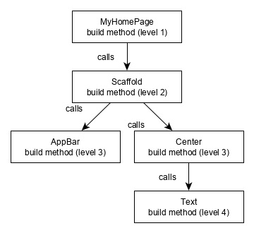
Widget Build Visualization
In Flutter, widgets can be grouped into multiple categories based on their features, as listed below −
Flutter has widgets specific to a particular platform - Android or iOS.
Android specific widgets are designed in accordance with Material design guideline by Android OS. Android specific widgets are called as Material widgets.
iOS specific widgets are designed in accordance with Human Interface Guidelines by Apple and they are called as Cupertino widgets.
Some of the most used material widgets are as follows −
Some of the most used Cupertino widgets are as follows −
Layout widgets
In Flutter, a widget can be created by composing one or more widgets. To compose multiple widgets into a single widget, Flutter provides large number of widgets with layout feature. For example, the child widget can be centered using Center widget.
Some of the popular layout widgets are as follows −
Container − A rectangular box decorated using BoxDecoration widgets with background, border and shadow.
Center − Center its child widget.
Row − Arrange its children in the horizontal direction.
Column − Arrange its children in the vertical direction.
Stack − Arrange one above the another.
We will check the layout widgets in detail in the upcoming Introduction to layout widgets.
State maintenance widgets
In Flutter, all widgets are either derived from StatelessWidget or StatefulWidget.
Widget derived from StatelessWidget does not have any state information but it may contain widget derived from StatefulWidget. The dynamic nature of the application is through interactive behavior of the widgets and the state changes during interaction. For example, tapping a counter button will increase / decrease the internal state of the counter by one and reactive nature of the Flutter widget will auto re-render the widget using new state information.
We will learn the concept of StatefulWidget widgets in detail in the upcoming State management lesson.
Platform independent / basic widgets
Flutter provides large number of basic widgets to create simple as well as complex user interface in a platform independent manner.
Let us see some of the basic widgets.
Text
Text widget is used to display a piece of string. The style of the string can be set by using style property and TextStyle class. The sample code for this purpose is as follows −
Text('Hello World!', style: TextStyle(fontWeight: FontWeight.bold))
Text widget has a special constructor, Text.rich, which accepts the child of type TextSpan to specify the string with different style. TextSpan widget is recursive in nature and it accepts TextSpan as its children. The sample code for this purpose is as follows −
Text.rich(
   TextSpan(
      children: [
         TextSpan(text: "Hello ", style:
         TextStyle(fontStyle: FontStyle.italic)),
         TextSpan(text: "World", style:
         TextStyle(fontWeight: FontWeight.bold)),
      ],
   ),
)
The most important properties of the Text widget are as follows −
maxLines, int − Maximum number of lines to show
overflow, TextOverFlow − Specify how visual overflow is handled using TextOverFlow class
style, TextStyle − Specify the style of the string using TextStyle class
textAlign, TextAlign − Alignment of the text like right, left, justify, etc., using TextAlign class
textDirection, TextDirection − Direction of text to flow, either left-to-right or right-to-left
Image
Image widget is used to display an image in the application. Image widget provides different constructors to load images from multiple sources and they are as follows −
Image − Generic image loader using ImageProvider
Image.asset − Load image from flutter project’s assets
Image.file − Load image from system folder
Image.memory − Load image from memory
Image.network − Load image from network
The easiest option to load and display an image in Flutter is by including the image as assets of the application and load it into the widget on demand.
Create a folder, assets in the project folder and place the necessary images.
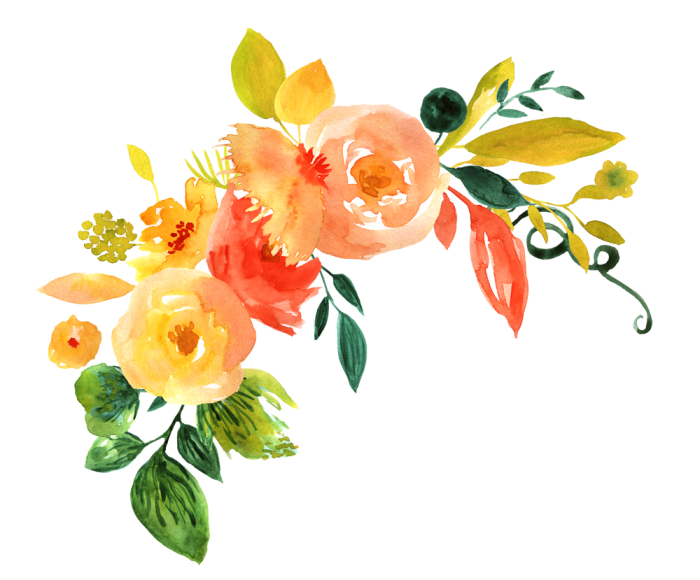
In the sample project below, we will be displaying a flower in our application. You can download the flower image below and place it in an assets folder in your project.
You can create a project by name flutter_week_6 or however you wish to call it.
In that project folder create a folder and name it assets. This is where you will be placing images that you will be using for your project.
You can download the flower image from this link and save it directly to your assets folder in your project or use an image on your machine.
Flower Image
https://kuulchat.com/courses/resources/images/flower.png
Or save it to your project folder
Open your pubspec.yaml file in your android studio and specify the assets as shown below
flutter:
   assets:
      - assets/flower.png
NOTE: Indenting is very important in the pubspec.yaml file. Your assets: should be in the same vertical line as the uses-material-design: true
Your pubspec.yaml should look like this
# The following section is specific to Flutter.
flutter:
  assets:
    - assets/flower.png
  # The following line ensures that the Material Icons font is
  # included with your application, so that you can use the icons in
  # the material Icons class.
  uses-material-design: true
As you can see the images path comes below the assets:
Each of the paths starts with - and then a space then the path follows. Our flower image is in the assets folder so our path will be assets/name_of_your_image.extension_of_the_image
Now, load and display the image in the application.
Image.asset('assets/flower.png')
The content of the body is what is displayed. You can include the image widget in the body of the scaffold as shown in the sample code of the main.dart file below:
import 'package:flutter/material.dart';

void main() {
  runApp(MyApp());
}

class MyApp extends StatelessWidget {
  // This widget is the root of your application.
  @override
  Widget build(BuildContext context) {
    return MaterialApp(
      title: 'Flutter Demo',
      theme: ThemeData(
        // This is the theme of your application.
        //
        // Try running your application with "flutter run". You'll see the
        // application has a blue toolbar. Then, without quitting the app, try
        // changing the primarySwatch below to Colors.green and then invoke
        // "hot reload" (press "r" in the console where you ran "flutter run",
        // or simply save your changes to "hot reload" in a Flutter IDE).
        // Notice that the counter didn't reset back to zero; the application
        // is not restarted.
        primarySwatch: Colors.blue,
        // This makes the visual density adapt to the platform that you run
        // the app on. For desktop platforms, the controls will be smaller and
        // closer together (more dense) than on mobile platforms.
        visualDensity: VisualDensity.adaptivePlatformDensity,
      ),
      home: MyHomePage(title: 'Image widget'),
    );
  }
}
class MyHomePage extends StatelessWidget {
  MyHomePage({Key key, this.title}) : super(key: key);
  final String title;

  @override
  Widget build(BuildContext context) {
    return Scaffold(
      appBar: AppBar( title: Text(this.title), ),
      body: Center( child: Image.asset("assets/flower.png")),
    );
  }
}
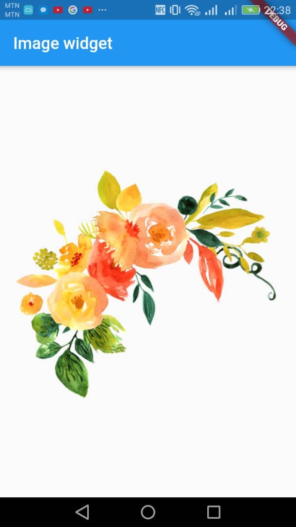
In the above, the content of the body of the scaffold is centered with the Center layout which has only one child, the image widget. The image is loaded from the project hence we use the Image.asset method to load our image as explained above. When you run the above sample code, having your flower.png in the assets folder of the project and recording the asset image path in the pubspec.yaml file, you should have an output like this:
Now let's modify our main.dart file so that the image will be loaded from the internet. The path to the flower image is:
https://kuulchat.com/courses/resources/images/flower.png
So we will use the Image.network("image link comes here");
In our case the image link is:
https://kuulchat.com/courses/resources/images/flower.png
Our modified main.dart file will therefore look like this:
import 'package:flutter/material.dart';

void main() {
  runApp(MyApp());
}

class MyApp extends StatelessWidget {
  // This widget is the root of your application.
  @override
  Widget build(BuildContext context) {
    return MaterialApp(
      title: 'Flutter Demo',
      theme: ThemeData(
        // This is the theme of your application.
        //
        // Try running your application with "flutter run". You'll see the
        // application has a blue toolbar. Then, without quitting the app, try
        // changing the primarySwatch below to Colors.green and then invoke
        // "hot reload" (press "r" in the console where you ran "flutter run",
        // or simply save your changes to "hot reload" in a Flutter IDE).
        // Notice that the counter didn't reset back to zero; the application
        // is not restarted.
        primarySwatch: Colors.blue,
        // This makes the visual density adapt to the platform that you run
        // the app on. For desktop platforms, the controls will be smaller and
        // closer together (more dense) than on mobile platforms.
        visualDensity: VisualDensity.adaptivePlatformDensity,
      ),
      home: MyHomePage(title: 'Image widget'),
    );
  }
}
class MyHomePage extends StatelessWidget {
  MyHomePage({Key key, this.title}) : super(key: key);
  final String title;

  @override
  Widget build(BuildContext context) {
    return Scaffold(
      appBar: AppBar( title: Text(this.title), ),
      body: Center( child: Image.network("https://kuulchat.com/courses/resources/images/flower.png")),
    );
  }
}
The most important properties of the Image widget are as follows −
image, ImageProvider − Actual image to load
width, double − Width of the image
height, double − Height of the image
alignment, AlignmentGeometry − How to align the image within its bounds
Example
Adjust Image Size by Setting Width and Height
Asset Image will be render in a 100 x 100 box.
  Image.asset(
    'assets/flower.png',
    height: 100,
    width: 100,
 )
Network Image will be render in a 100 x 100 box.
Image.network("https://kuulchat.com/courses/resources/images/flower.png",width:100,height:100)
Adjust Asset Image Size by Scale
The image will look bigger if the scale is less than 1.
Image.asset(
    'assets/flower.png',
    scale: 0.8
 )
Adjust Network Image Size by Scale
The image will look bigger if the scale is less than 1.
Image.network("https://kuulchat.com/courses/resources/images/flower.png",scale: 0.8)To align an image, use the alignment property.
Image.network("https://kuulchat.com/courses/resources/images/flower.png",width:200,height:300,alignment: Alignment.center,)Fit Image Size
In this example, the image size will be fitted to its width.
Image.asset(
    'assets/flower.png',
    height: 100,
    width: 200,
    fit: BoxFit.fitWidth,
 )
Blend Image with a Color
Define a color that will be blended to the image's pixels.
Image.asset(
    'assets/flower.png',
    height: 100,
    width: 100,
    color: Colors.red,
    colorBlendMode: BlendMode.darken,
    fit: BoxFit.fitWidth,
 )
Icon
Icon widget is used to display a glyph from a font described in IconData class. The code to load a simple email icon is as follows −
Icon(Icons.email)
You can find the list of flutter icons at:
https://api.flutter.dev/flutter/material/Icons-class.html
We can modify our flutter application code to display an email icon instead of an image. The code is shown below:
import 'package:flutter/material.dart';

void main() {
  runApp(MyApp());
}

class MyApp extends StatelessWidget {
  // This widget is the root of your application.
  @override
  Widget build(BuildContext context) {
    return MaterialApp(
      title: 'Flutter Demo',
      theme: ThemeData(
        // This is the theme of your application.
        //
        // Try running your application with "flutter run". You'll see the
        // application has a blue toolbar. Then, without quitting the app, try
        // changing the primarySwatch below to Colors.green and then invoke
        // "hot reload" (press "r" in the console where you ran "flutter run",
        // or simply save your changes to "hot reload" in a Flutter IDE).
        // Notice that the counter didn't reset back to zero; the application
        // is not restarted.
        primarySwatch: Colors.blue,
        // This makes the visual density adapt to the platform that you run
        // the app on. For desktop platforms, the controls will be smaller and
        // closer together (more dense) than on mobile platforms.
        visualDensity: VisualDensity.adaptivePlatformDensity,
      ),
      home: MyHomePage(title: 'Icon widget'),
    );
  }
}
class MyHomePage extends StatelessWidget {
  MyHomePage({Key key, this.title}) : super(key: key);
  final String title;

  @override
  Widget build(BuildContext context) {
    return Scaffold(
      appBar: AppBar( title: Text(this.title), ),
      body: Center( child: Icon(Icons.email)),
    );
  }
}
LAYOUT WIDGETS
Flutter provides quite a lot of specially designed widgets like Container, Center, Align, etc., only for the purpose of laying out the user interface. Widgets build by composing other widgets normally use layout widgets.
Type of Layout Widgets
Layout widgets can be grouped into two distinct category based on its child −
Let us learn both type of widgets and its functionality in the upcoming sections.
Single Child Widgets
In this category, widgets will have only one widget as its child and every widget will have a special layout functionality.
For example, Center widget just centers it child widget with respect to its parent widget and Container widget provides complete flexibility to place it child at any given place inside it using different option like padding, decoration, etc.,
Single child widgets are great options to create high quality widget having single functionality such as button, label, etc.,
The Container Widget
Container means a parent widget that contains a child widget and manages it, such as width, height, background and so on.
The Container Constructor
Container({
  Key key,
  this.alignment,
  this.padding,
  Color color,
  Decoration decoration,
  this.foregroundDecoration,
  double width,
  double height,
  BoxConstraints constraints,
  this.margin,
  this.transform,
  this.child,
})
1. this.child
This parameter is used to add a child widget for the container
2. Color color
The color is used to specify the background color of the container
3. this.padding
This parameter is used to set its child distance from four directions.
We use the EdgeInsets class to specify the padding of the container
The EdgeInsets class just depends on the distance from the top, bottom, left and right.
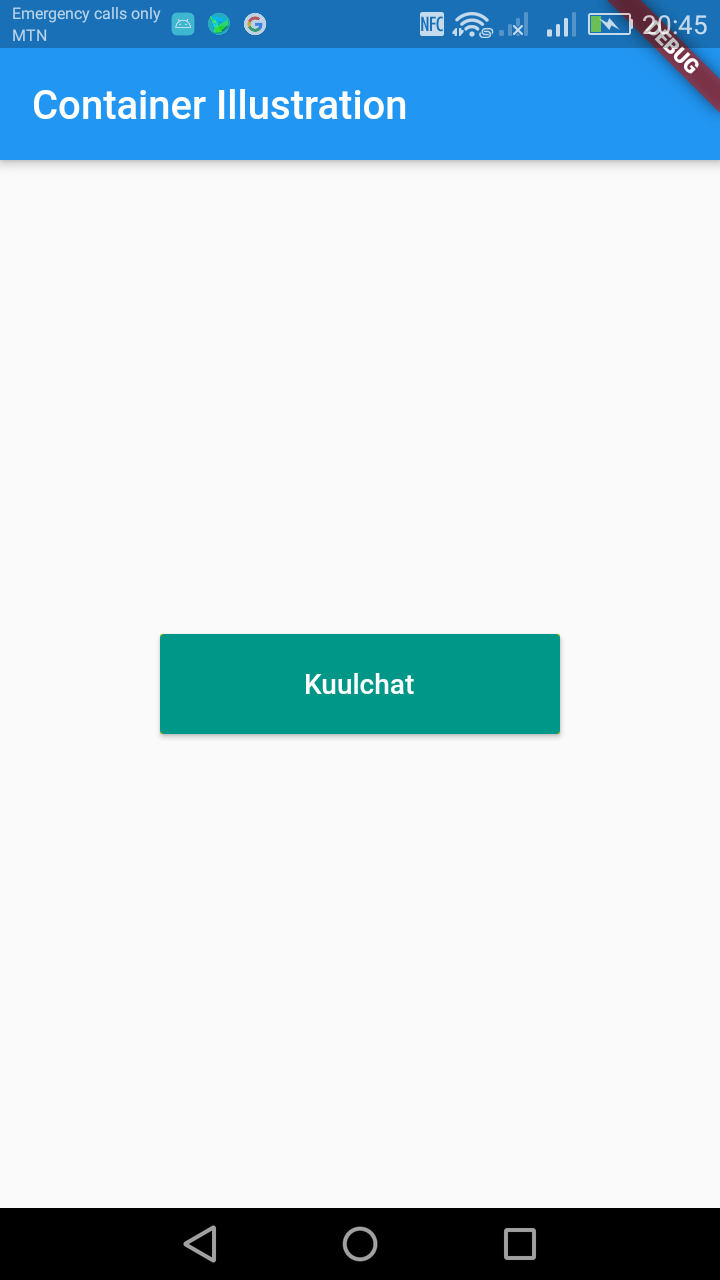
Example
import 'package:flutter/material.dart';

void main() => runApp(MyApp());

class MyApp extends StatelessWidget {
  @override
  Widget build(BuildContext context) {
    return MaterialApp(
      title: 'Welcome to Flutter',
      home: Scaffold(
        appBar: AppBar(
          title: Text('Container Illustration'),
        ),
        body: Center(
            child:Container(
              color: Colors.yellow,
              padding:EdgeInsets.only(left: 10.0, right: 50.0, top: 10, bottom: 30),
              child: Container(
                color: Colors.blue,
                child: Text("Padding Example"),
              ),
            )
        ),
      ),
    );
  }
}
To padding the container with the same padding for top, left, right and bottom, you can use:
padding:EdgeInsets.all(10),4. width & height
double width,
double height,
As you can see, it will control its width, height with these two parameters.
You can add width and height to our previous container example.
import 'package:flutter/material.dart';

void main() => runApp(MyApp());

class MyApp extends StatelessWidget {
  @override
  Widget build(BuildContext context) {
    return MaterialApp(
      title: 'Welcome to Flutter',
      home: Scaffold(
        appBar: AppBar(
          title: Text('Container Illustration'),
        ),
        body: Center(
            child:Container(
              width: 200,
              height: 100,
              color: Colors.yellow,
              padding:EdgeInsets.only(left: 10.0, right: 50.0, top: 10, bottom: 30),
              child: Container(
                color: Colors.blue,
                child: Text("Padding Example"),
              ),
            )
        ),
      ),
    );
  }
}
5. this.margin
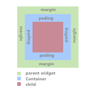
This is similar to the padding except, margin is for outer spacing to the parent and padding is inner spacing child from the parent.
You can use the same EdgeInsets class to specify the margin of the container.
margin:EdgeInsets.only(left: 10.0, right: 50.0, top: 10, bottom: 30),or
margin:EdgeInsets.all(10),6. this.alignment
For defining the position of your container. We use the Alignment class for this. The alignment options are:
Example
alignment: Alignment.topLeft,7. constrains
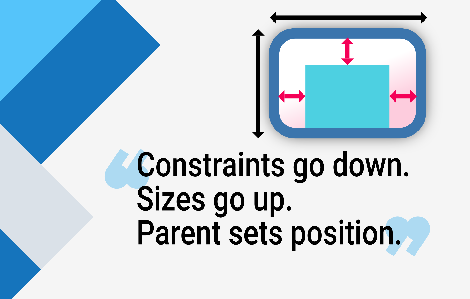
Constraints go down. Sizes go up. Parent sets position.
Flutter layout can’t really be understood without knowing this rule, so Flutter developers should learn it early on.
In more detail:
A widget gets its own constraints from its parent. A constraint is just a set of 4 doubles: a minimum and maximum width, and a minimum and maximum height.
Then the widget goes through its own list of children. One by one, the widget tells its children what their constraints are (which can be different for each child), and then asks each child what size it wants to be.
Then, the widget positions its children (horizontally in the x axis, and vertically in the y axis), one by one.
And, finally, the widget tells its parent about its own size (within the original constraints, of course).
For example, if a composed widget contains a column with some padding, and wants to lay out its two children as follows:
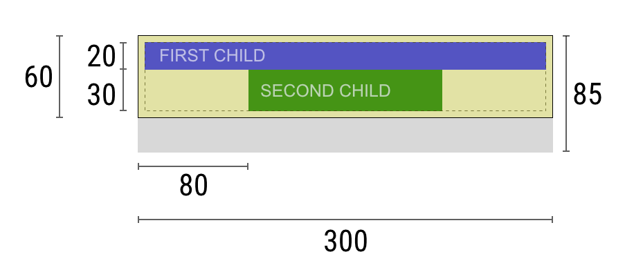
The negotiation goes something like this:
Widget: “Hey parent, what are my constraints?”
Parent: “You must be from 80 to 300 pixels wide, and 30 to 85 tall.”
Widget: “Hmmm, since I want to have 5 pixels of padding, then my children can have at most 290 pixels of width and 75 pixels of height.”
Widget: “Hey first child, You must be from 0 to 290 pixels wide, and 0 to 75 tall.”
First child: “OK, then I wish to be 290 pixels wide, and 20 pixels tall.”
Widget: “Hmmm, since I want to put my second child below the first one, this leaves only 55 pixels of height for my second child.”
Widget: “Hey second child, You must be from 0 to 290 wide, and 0 to 55 tall.”
Second child: “OK, I wish to be 140 pixels wide, and 30 pixels tall.”
Widget: “Very well. My first child has position x: 5 and y: 5, and my second child has x: 80 and y: 25.”
Widget: “Hey parent, I’ve decided that my size is going to be 300 pixels wide, and 60 pixels tall.”
Limitations
As a result of the layout rule mentioned above, Flutter’s layout engine has a few important limitations:
ConstrainedBox
ConstrainedBox is a widget that imposes additional constraints on its child. While you can set only the width and the height of a widget using SizedBox widget, with ConstrainedBox, you can also set the minimum and maximum values of the widget's width and height thanks to the usage of BoxConstraints.
BoxConstraints allows you to define the minimum and maximum width and height of a widget. Below is the constructor of BoxConstraints.
const BoxConstraints({
    this.minWidth = 0.0,
    this.maxWidth = double.infinity,
    this.minHeight = 0.0,
    this.maxHeight = double.infinity,
  })
Examples
Minimum width and height
import 'package:flutter/material.dart';
void main() => runApp(MyApp());
class MyApp extends StatelessWidget {
@override
Widget build(BuildContext context) {
return MaterialApp(
title: 'Welcome to Flutter',
home: Scaffold(
appBar: AppBar(
title: Text('Container Illustration'),
),
body: Center(
child:Container(
color: Colors.yellow,
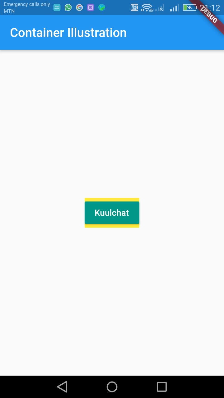
constraints: BoxConstraints(
minHeight: 50.0,
minWidth: 200.0,
),
child: RaisedButton(
color: Colors.teal,
child: Text('Kuulchat', style: TextStyle(color: Colors.white)),
onPressed: () {},
),
)
),
),
);
}
}From the above code, the child widget takes minimum height of 50 and minimum width of 200. Since the widget has no assigned width and height, it will have that minimum width and height. In case the child widget has width and height smaller than the minimum width and height of the parent, the child will have the minimum width and height of the parent.
Maximum width and height
import 'package:flutter/material.dart';
void main() => runApp(MyApp());
class MyApp extends StatelessWidget {
@override
Widget build(BuildContext context) {
return MaterialApp(
title: 'Welcome to Flutter',
home: Scaffold(
appBar: AppBar(
title: Text('Container Illustration'),
),
body: Center(
child:Container(
color: Colors.yellow,
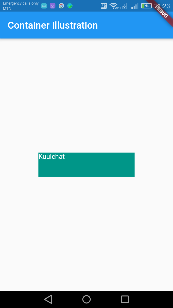
constraints: BoxConstraints(
maxHeight: 50.0,
maxWidth: 200.0,
),
child: RaisedButton(
color: Colors.teal,
child: Text('Kuulchat', style: TextStyle(color: Colors.white)),
onPressed: () {},
),
)
),
),
);
}
}For maximum width and height, the child widget can't exceed these values. A child will retain its width and height so far as it doesn't exceed the parent maximum width and height.
A child widget which has its width or height more than the parent's maximum height or width, will have the width or height of its parent and it's width or height which exceeded is ignored.
Example
import 'package:flutter/material.dart';

void main() => runApp(MyApp());

class MyApp extends StatelessWidget {
  @override
  Widget build(BuildContext context) {
    return MaterialApp(
      title: 'Welcome to Flutter',
      home: Scaffold(
        appBar: AppBar(
          title: Text('Container Illustration'),
        ),
        body: Center(
            child:Container(
              color: Colors.yellow,
              constraints: BoxConstraints(
              maxHeight: 50.0,
              maxWidth: 200.0,
              ),
              child: Container(
                color: Colors.teal,
                width:500,
                height:500,
                child: Text('Kuulchat', style: TextStyle(color: Colors.white)),
              ),
            )
        ),
      ),
    );
  }
}
Setting the background image of a container
The decoration property is used to set the background image of the container.
decoration: BoxDecoration(
            image: DecorationImage(
                image: AssetImage("images/bg.jpg"), fit: BoxFit.cover)),
Set the image of the background of the container using the Image property as explained above.
Place the content of the container in a child widget that can contain multiple children in case your container content will have multiple children.
Example
import 'package:flutter/material.dart';

void main() => runApp(MyApp());

class MyApp extends StatelessWidget {
  @override
  Widget build(BuildContext context) {
    return MaterialApp(
      title: 'Welcome to Flutter',
      home: Scaffold(
        appBar: AppBar(
          title: Text('Background Image Illustration'),
        ),
        body: Container(
            decoration: new BoxDecoration(
                image: new DecorationImage(
                    image: AssetImage("assets/bg.jpg"),
                    fit: BoxFit.cover)),
                child:Row(

                  children: [
                    Container(
                      color: Colors.red,
                      height: 50.0,
                      width: 50.0,
                    ),
                    Container(
                      color: Colors.yellow,
                      height: 50.0,
                      width: 50.0,
                    ),
                    Container(
                      color: Colors.green,
                      height: 50.0,
                      width: 50.0,
                    ),
                  ],
                ),
           ),
      ),
    );
  }
}
The background image for the above code is shown below. You can save it and use it to run the code.
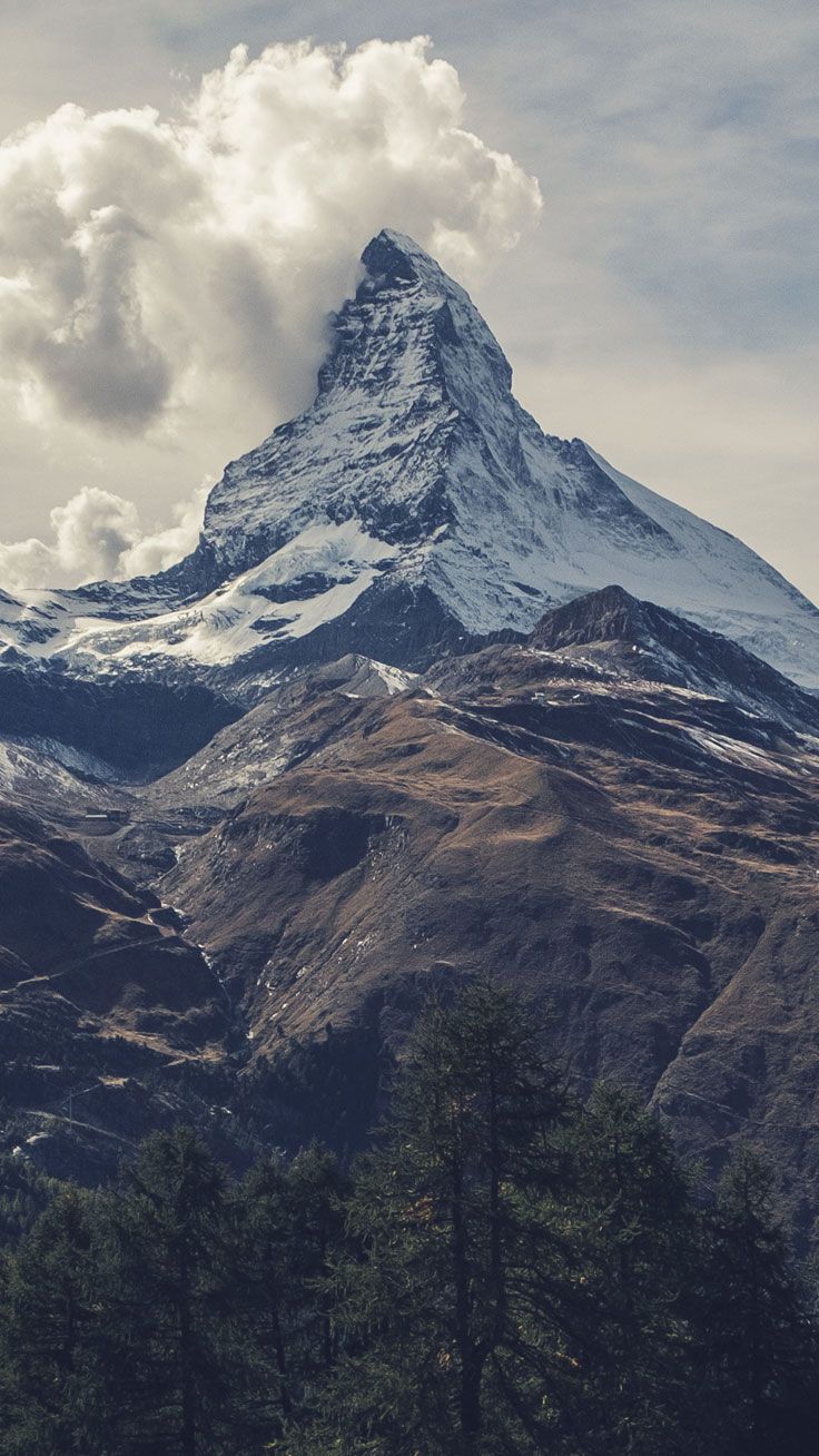
Remember to record it in the pubspec.yaml file as explained in the image widget above.
NOTE
The container height with the background will be according to the size of its child
If you want the background image to cover the entire height of the screen, you will have to place it in a stack widget and the container should have a Center widget as its child.
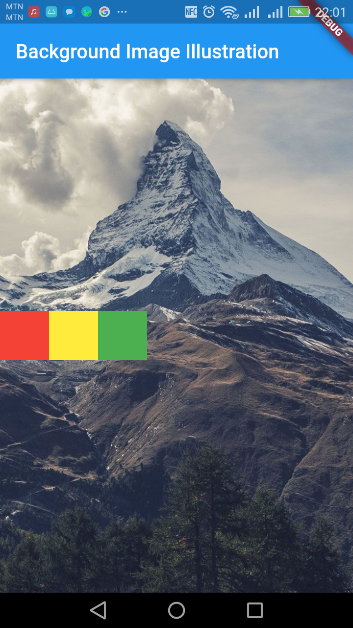
Example
import 'package:flutter/material.dart';

void main() => runApp(MyApp());

class MyApp extends StatelessWidget {
  @override
  Widget build(BuildContext context) {
    return MaterialApp(
      title: 'Welcome to Flutter',
      home: Scaffold(
        appBar: AppBar(
          title: Text('Background Image Illustration'),
        ),
        body: Stack(
            children: [ Container(
            decoration: new BoxDecoration(
                image: new DecorationImage(
                    image: AssetImage("assets/bg.jpg"),
                    fit: BoxFit.cover)),
                child:Center(
                child:Row(

                  children: [
                    Container(
                      color: Colors.red,
                      height: 50.0,
                      width: 50.0,
                    ),
                    Container(
                      color: Colors.yellow,
                      height: 50.0,
                      width: 50.0,
                    ),
                    Container(
                      color: Colors.green,
                      height: 50.0,
                      width: 50.0,
                    ),
                  ],
                ),
                ),
           ),
          ],
        ),
      ),
    );
  }
}
If your content of your container will be more than the height of the screen, you have to use the SingleChildScrollView widget so that the content can be scrolled.
Example
import 'package:flutter/material.dart';

void main() => runApp(MyApp());

class MyApp extends StatelessWidget {
  @override
  Widget build(BuildContext context) {
    return MaterialApp(
      title: 'Welcome to Flutter',
      home: Scaffold(
        appBar: AppBar(
          title: Text('Background Image Illustration'),
        ),
        body: Stack(
            children: <Widget>[ Container(
            decoration: new BoxDecoration(
                image: new DecorationImage(
                    image: AssetImage("assets/bg.jpg"),
                    fit: BoxFit.cover)),
                child:Center(
                  child: SingleChildScrollView(
                  padding: EdgeInsets.all(30.0),
                  child:Row(

                    children: [
                      Container(
                        color: Colors.red,
                        height: 50.0,
                        width: 50.0,
                      ),
                      Container(
                        color: Colors.yellow,
                        height: 50.0,
                        width: 50.0,
                      ),
                      Container(
                        color: Colors.green,
                        height: 50.0,
                        width: 50.0,
                      ),
                    ],
                  ),
                  ),
                ),
           ),
          ],
        ),
      ),
    );
  }
}

Digital Address: GZ-033-0057
King Kotey Road
Teshie - Accra
Ghana
+233 59 993 7122
Finland
+358 44 986 0934
info@kuulchat.com
© Copyright 2015 - 2024
All Rights Reserved