HTML tables allow web developers to arrange data into rows and columns.
| Student Name | ID | Age |
|---|
| Joseph Martey | 20142016 | 14 |
| Abigail Gyimah | 20141801 | 12 |
| Peace Avudu | 20140132 | 15 |
| Irene Nartey | 20141231 | 13 |
| Gideon Anum | 20143212 | 14 |
| Grace Jamal | 20142121 | 15 |
<!DOCTYPE html>
<html>
<head>
<style>
table {
  font-family: arial, sans-serif;
  border-collapse: collapse;
  width: 100%;
}

td, th {
  border: 1px solid #dddddd;
  text-align: left;
  padding: 8px;
}

tr:nth-child(even) {
  background-color: #dddddd;
}
</style>
</head>
<body>

<h2>HTML Table</h2>

<table>
  <tr>
    <th>Student Name</th>
    <th>ID</th>
    <th>Age</th>
  </tr>
  <tr>
    <td>Joseph Martey</td>
    <td>20142016</td>
    <td>14</td>
  </tr>
  <tr>
    <td>Abigail Gyimah</td>
    <td>20141801</td>
    <td>12</td>
  </tr>
  <tr>
    <td>Peace Avudu</td>
    <td>20140132</td>
    <td>15</td>
  </tr>
  <tr>
    <td>Irene Nartey</td>
    <td>20141231</td>
    <td>13</td>
  </tr>
  <tr>
    <td>Gideon Anum</td>
    <td>20143212</td>
    <td>14</td>
  </tr>
  <tr>
    <td>Grace Jamal</td>
    <td>20142121</td>
    <td>15</td>
  </tr>
</table>

</body>
</html>
The <table> tag defines an HTML table.
Each table row is defined with a <tr> tag. Each table header is defined with a <th> tag. Each table data/cell is defined with a <td> tag.
By default, the text in <th> elements are bold and centered.
By default, the text in <td> elements are regular and left-aligned.
<table style="width:100%">
  <tr>
    <th>Firstname</th>
    <th>Lastname</th>
    <th>Age</th>
  </tr>
  <tr>
    <td>Michael</td>
    <td>Adarkwah</td>
    <td>20</td>
  </tr>
  <tr>
    <td>Evelyn</td>
    <td>Mensah</td>
    <td>22</td>
  </tr>
</table>
STYLING A TABLE
table{
font-family: arial, sans-serif;
border-collapse: collapse;
width: 100%;
}
td,th {
border: 1px solid #dddddd;
text-align: left;
padding: 8px;
}
tr:nth-child(even){
background-color: #dddddd;
}
border-collapse:separate|collapse
| Value | Description |
|---|
| separate | Borders are separated; each cell will display its own borders. This is default. |
| collapse | Borders are collapsed into a single border when possible (border-spacing and empty-cells properties have no effect) |
HTML Table - Cell that Span Many Columns
To make a cell span more than one column, use the colspan attribute:
HTML Table - Cell that Span Many Columns
| Date | Name | Amount |
|---|
| 29.07.2020 | Naomi Annang | Ghc 1,200.00 |
| 29.07.2020 | David Badu | Ghc 800.00 |
| Total | Ghc 2,000.00
|
<h2 style="margin-top:10px;">HTML Table - Cell that Span Many Columns</h2>
<table width="100%">
<tr>
<th>Date</th>
<th>Name</th>
<th>Amount</th>
</tr>
<tr>
<td>29.07.2020</td>
<td>Naomi Annang</td>
<td>Ghc 1,200.00</td>
</tr>
<tr>
<td>29.07.2020</td>
<td>David Badu</td>
<td>Ghc 800.00</td>
</tr>
<tr>
<td colspan="2" style="text-align:right;"><b>Total</b></td>
<td>Ghc 2,000.00</td>
</tr>
</table>
HTMLTable - Cell that Span Many Rows
To make a cell span more than one row, use the rowspan attribute:
HTML Table - Cell that Span Many Rows
| Date | Name | Amount |
|---|
| 28.07.2020 | Naomi Annang | Ghc 1,200.00 |
| David Badu | Ghc 800.00 |
| Gifty Azuma | Ghc 500.00 |
| 29.07.2020 | Kofi Teye | Ghc 200.00 |
| Total | Ghc 2,700.00 |
<h2 style="margin-top:10px;">HTML Table - Cell that Span Many Rows</h2>
<table width="100%">
<tr>
<th>Date</th>
<th>Name</th>
<th>Amount</th>
</tr>
<tr>
<tdrowspan="3">28.07.2020</td>
<td>NaomiAnnang</td>
<td>Ghc 1,200.00</td>
</tr>
<tr>
<td>DavidBadu</td>
<td>Ghc800.00</td>
</tr>
<tr>
<td>GiftyAzuma</td>
<td>Ghc500.00</td>
</tr>
<tr>
<td>29.07.2020</td>
<td>KofiTeye</td>
<td>Ghc200.00</td>
</tr>
<tr>
<tdcolspan="2" style="text-align:right;"><b>Total</b></td>
<td>Ghc2,700.00</td>
</tr>
</table>
HTML Table - Add a Caption
To add a caption to a table, use the <caption> tag:
School Fees
| Date | Name | Amount |
|---|
| 28.07.2020 | Naomi Annang | Ghc 1,200.00 |
| David Badu | Ghc 800.00 |
| Gifty Azuma | Ghc 500.00 |
| 29.07.2020 | Kofi Teye | Ghc 200.00 |
| Total | Ghc 2,700.00 |
<h2 style="margin-top:10px;">Caption</h2>
<table width="100%">
<caption>School Fees</caption>
<tr>
<th>Date</th>
<th>Name</th>
<th>Amount</th>
</tr>
<tr>
<td rowspan="3">28.07.2020</td>
<td>Naomi Annang</td>
<td>Ghc 1,200.00</td>
</tr>
<tr>
<td>David Badu</td>
<td>Ghc 800.00</td>
</tr>
<tr>
<td>Gifty Azuma</td>
<td>Ghc 500.00</td>
</tr>
<tr>
<td>29.07.2020</td>
<td>Kofi Teye</td>
<td>Ghc 200.00</td>
</tr>
<tr>
<td colspan="2" style="text-align:right;"><b>Total</b></td>
<td>Ghc 2,700.00</td>
</tr>
</table>
HTML Links - Hyperlinks
HTML links are hyperlinks.
You can click on a link and jump to another page.
When you move the mouse over a link, the mouse arrow will turn into a little hand.
Note: A link does not have to be text. A link can be an image or any other HTML element!
This can be seen on many websites. When you click on a logo of a website, it jumps to the home page. This is because a link is en wrapped between the logo image.
HTML Links - Syntax
The HTML <a> tag defines a hyperlink. It has the following syntax:
<a href="url">link text</a>
The most important attribute of the <a> element is the href attribute, which indicates the link's destination.
The link text is the part that will be visible to the reader.
Clicking on the link text, will send the reader to the specified URL address.
Examples:
<p><a href=” https://google.com/”>Visit Google Website</a></p>
<p><a href=” https://facebook.com/”>Visit Facebook Website</a></p>
<p><a href=” https://kuulchat.com/”>Visit Kuulchat Website</a></p>
<p><a href=” http://instagram.com/”>Visit Instagram Website</a></p>
<p><a href=” signup.php”>Register</a></p>
NOTE: If your href is not in the format http:// or https//, then the browser will assume your page you want to move to is within your folder/server.
So remember to add the http or https for website links.
Examples:
<p><a href=” facebook.com/”>Visit Facebook Website</a></p>
This is the output I got for the above hyperlink:
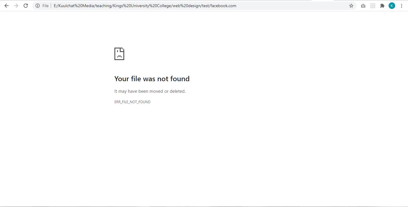
Figure: File not found for href facebook.com
<p><a href=” google.com/”>Visit Google Website</a></p>
This is the output I got for the above hyperlink:
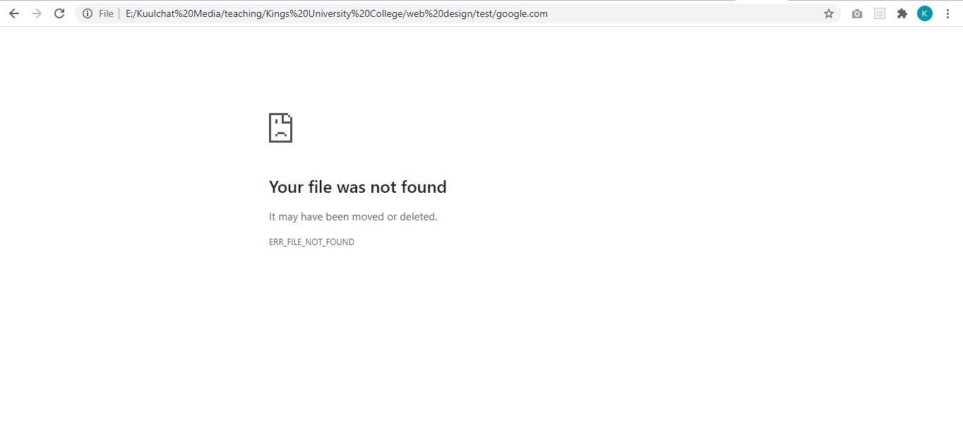
Figure: File not found for href google.com
As you can see, you should always add http or https to link href. Without them,the browser sees the href as a file on your server or in your folder.
Absolute URLs vs.Relative URLs
Link/Url in which the href has a full web address (with http or https part) is referred to as an absolute link.
A local link (a link to a page within the same website) is specified with a relative URL (without the "https://www" part):
By default, links will appear as follows in all browsers:
An unvisited link is underlined and blue
A visited link is underlined and purple
An active link is underlined and red
STYLING LINKS
To change the default link styles listed above, you could use the following css styles:
Remove underline from link
a{
text-decoration:none;
}
Remove the default blue link color
a{
color:black;
}
NOTE: The color must be the same as the color for the body so the links don’t look different from other texts.
To style a link when the mouse is moved over, you the :hover keyword to style your link.
Thus:
a:hover{
text-decoration:underline;
}
The above style will under links that are hovered (mouse moved over)
You can also change the color of a link when hover by adding the color attribute.For instance if I want to change the color of links hover to blue, I can add the attribute below:
a:hover{
text-decoration:underline;
color:blue;
}
The:active selector is used to select and style the active link.
A link becomes active when you click on it.
Tip:The :active selector can be used on all elements, not only links.
Tip:Use the :link selector to style links to unvisited pages, the :visited selector to style links to visited pages, and the :hover selector to style links when you mouse over them.
Note::active MUST come after :hover (if present) in the CSS definition in order to be effective!
To style a link which has been visited already, you have to use the :visited keyword
If I want to style links that have been visited to have a yellow color, I can therefore write the style below:
a:visited{
color:yellow;
}
The same applies to active links. You can use the :active keyword and write your style attribute(s).
a:visited{
color:green;
}
The active attribute is visible when the link is clicked and about to move to the page assigned in the href.
HTML Links - The target Attribute
By default, the linked page will be displayed in the current browser window. To change this, you must specify another target for the link.
The target attribute specifies where to open the linked document.
The target attribute can have one of the following values:
_self- Default. Opens the document in the same window/tab as it was clicked
_blank- Opens the document in a new window or tab
_parent- Opens the document in the parent frame
_top- Opens the document in the full body of the window
The most common used attributes are the _blank and the default attribute (_self)which is never written since it is the default. The _parent, _top and _self all looks similar.
HTML Links - Use an Image as a Link
To use an image as a link, just put the <img> tag inside the <a> tag:
For example, if I want to direct visitors to Kuulchat home page when the logo is clicked, I can write the link below:
<p><a href=” https://kuulchat.com/”><imgsrc=”images/logo.png” width=”70” /></a></p>
Link to an Email Address
Use mailto: inside the href attribute to create a link that opens the user's email program (to let them send a new email):
For instance if I want a user to open the email program and send an image to info@kuulchatmedia.com,I will write the below link:
<p><a href=”mailto:info@kuulchatmedia.com”>Email Us</a></p>
ADDING LINK TO A BUTTON OR OTHER ELEMENT
You can use a javascript to add a link to a button or any other element. Theon Click javascript method is used to achieve that.
The other javascript method to call is window.location or document.locationand assign the link in a single quotation, thus window.location =‘https://kuulchat.com’ for instance. So a complete code to direct a user to kuulchat.com when a button is clicked will be:
<button onClick=”window.location=’https://kuulchat.com’”>Kuulchat.com</button>
or
<button onClick=”document.location=’https://kuulchat.com’”>Kuulchat.com</button>
NOTE: the onClick has a double quotation, “” and inside it, the window.location or document.locationhas a single quotation in which the href is specified.
Fora local url, you just write the name of the file you want to move to. For instance, a sign up button could be written as
<button onClick=”document.location=’signup.php’”>SignUp</button>
or
<button onClick=”window.location=’signup.php’”>SignUp</button>
To open a new tab when the button or the HTML element is clicked, you can use the JavaScript window.open(‘link comes here’,’target goes here’);
For instance to modify the above syntax so when the sign up button is clicked a new tab is opened, we can write:
<button onClick=”window.open(‘signup.php’,’_blank’)”>Sign Up</button>
If you are adding a click to an element which is not a button, you have to style that element to have the cursor changed to hand so user knows the element can be clicked to move to a page.
For example if I wat to add a click to a paragraph (p) tag, I will add the style attribute below:
cursor:pointer
This will make the cursor changed as if being hover over a link. Thus I can write:
<p style=”cursor:pointer” onClick=”window.location=’contact.php’”>Contact Us</p>
Link Titles
The title attribute specifies extra information about an element. The information is most often shown as a tooltip text when the mouse moves over the element.
Example:
<a href=”mailto:info@kuulchatmedia.com” title=”Click here to send us an email”>Email Us</a>
HTML LIST
HTML lists allow web developers to group a set of related items in lists.
Example
An unordered HTML list:
An ordered HTML list:
- First item
- Second item
- Third item
- Fourth item
Unordered HTML List
An unordered list starts with the <ul>tag. Each list item starts with the <li> tag.
The list items will be marked with bullets (small black circles) by default:
An unordered list can be styled to be used as a menu for a page.
Example:
<ul>
<li><ahref=”index.html”>Home</a></li>
<li><ahref=”about.html”>About Us</a></li>
<li><ahref=”services.html”>Our Services</a></li>
<li><ahref=”contact.html”>Contact Us</a></li>
</ul>
We will style it later in the next slides to use as a menu
Ordered HTML List
An ordered list starts with the <ol> tag. Each list item starts with the<li> tag.
The list items will be marked with numbers by default:
Examples:
<h2>MyFavourite Teachers</h2>
<ol>
<li>Mr. Anane</li>
<li>ProfessorAlotey</li>
<li>Mr. Ashong</li>
</ol>
Ordered HTML List -The Type Attribute
The type attribute of the <ol> tag, defines the type of the list item marker:
| Type | Description |
|---|
| type="1" | The list items will be numbered with numbers (default) |
| type="A" | The list items will be numbered with uppercase letters |
| type="a" | The list items will be numbered with lowercase letters |
| type="I" | The list items will be numbered with uppercase roman numbers |
| type="i" | The list items will be numbered with lowercase roman numbers |
Examples
<h2>My Favourite Teachers</h2>
<ol type=”1”>
<li>Mr. Anane</li>
<li>Professor Alotey</li>
<li>Mr. Ashong</li>
</ol>
<h2>My Favourite Teachers</h2>
<ol type=”A”>
<li>Mr. Anane</li>
<li>Professor Alotey</li>
<li>Mr. Ashong</li>
</ol>
<h2>My Favourite Teachers</h2>
<ol type=”a”>
<li>Mr. Anane</li>
<li>Professor Alotey</li>
<li>Mr. Ashong</li>
</ol>
<h2>My Favourite Teachers</h2>
<ol type=”I”>
<li>Mr. Anane</li>
<li>Professor Alotey</li>
<li>Mr. Ashong</li>
</ol>
<h2>My Favourite Teachers</h2>
<ol type=”i”>
<li>Mr. Anane</li>
<li>Professor Alotey</li>
<li>Mr. Ashong</li>
</ol>
By default, an ordered list will start counting from 1. If you want to start counting from a specified number, you can use the start attribute:
Examples:
<h2>My Favourite Teachers</h2>
<ol type="1" start="20">
<li>Mr. Anane</li>
<li>Professor Alotey</li>
<li>Mr. Ashong</li>
</ol>
<h2>My Favourite Teachers</h2>
<ol type="I" start="20">
<li>Mr. Anane</li>
<li>Professor Alotey</li>
<li>Mr. Ashong</li>
</ol>
<h2>My Favourite Teachers</h2>
<ol type="i” start="20">
<li>Mr. Anane</li>
<li>Professor Alotey</li>
<li>Mr. Ashong</li>
</ol>
NESTED ORDERED LIST
<ol>
<li>Coffee</li>
<li>Tea
<ol>
<li>Blacktea</li>
<li>Greentea</li>
</ol>
</li>
<li>Milk</li>
</ol>
HTML Description Lists
A description list is a list of terms, with a description of each term.
The<dl> tag defines the description list, the <dt> tag defines the term (name), and the <dd> tag describes each term:
Example
<h2>My Favourite Teachers</h2>
<dl>
<dt>Mr. Anane</dt>
<dd>Teaches Chemistry</dd>
<dt>Professor Alotey</dt>
<dd>Teaches Physics</dd>
<dt>Mr. Ashong</dt>
<dd>Teaches Web Design</dd>
</dl>
| Tag | Description |
|---|
| <ul> | Defines an unordered list |
| <ol> | Defines an ordered list |
| <li> | Defines a list item |
| <dl> | Defines a description list |
| <dt> | Defines a term in a description list |
| <dd> | Describes the term in a description list |
STYLING THE LIST
Unordered HTML List -Choose List Item Marker
The CSS list-style-type property is used to define the style of the list item marker. It can have one of the following values:
| Value | Description |
|---|
| disc | Sets the list item marker to a bullet (default) |
| circle | Sets the list item marker to a circle |
| square | Sets the list item marker to a square |
| none | The list items will not be marked |
The list-style-type property is set to none when the list is to be used as a menu. We can modify our above menu html code as:
<ul style=” list-style-type :none”>
<li><a href=”index.html”>Home</a></li>
<li><ahref=”about.html”>About Us</a></li>
<li><ahref=”services.html”>Our Services</a></li>
<li><ahref=”contact.html”>Contact Us</a></li>
</ul>
Using the other list-style-type properties:
<h2>My Favourite Teachers</h2>
<ul style=” list-style-type :square”>
<li>Mr. Anane</li>
<li>Professor Alotey</li>
<li>Mr. Ashong</li>
</ul>
<h2>My Favourite Teachers</h2>
<u style=” list-style-type :circle”>
<li>Mr. Anane</li>
<li>Professor Alotey</li>
<li>Mr. Ashong</li>
</ul>
As stated above, the default if no list-style-type is specified is disc (bullet) as you saw in the menu example.
Nested HTML Lists
Lists can be nested (list inside list):
Example:
<h2>Beverages</h2>
<ul>
<li>Coffee</li>
<li>Tea
<ul>
<li>Black tea</li>
<li>Green tea</li>
</ul>
</li>
<li>Milk</li>
</ul>
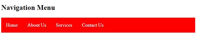
Horizontal List with CSS
One popular way is to style a list horizontally, to create a navigation menu:
Let’s add the style below to our menu list to complete our horizontal menu
<!DOCTYPE html>
<html>
<head>
<style>
ul
{
  list-style-type: none;
  margin: 0;
  padding: 0;
  overflow: hidden;
  background-color:red;
}
li
{
  float: left;
}
li a {
  display: block;
  color: white;
  text-align: center;
  padding: 16px;
  text-decoration: none;
}
li a:hover {
  opacity:0.8;
}
</style>
</head>
<body>
<h2>Navigation Menu</h2>
<ul>
  <li><a href="index.html">Home</a></li>
  <li><a href="about.html">About Us</a></li>
  <li><a href="services.html">Services</a></li>
  <li><a href="contact.html">Contact Us</a></li>
</ul>
</body>
</html>
The Div tag
A<div> section in a document that is styled with CSS:
The<div> tag defines a division or a section in an HTML document.
The<div> tag is used as a container for HTML elements - which is then styled with CSS or manipulated with JavaScript.
The<div> tag is easily styled by using the class or id attribute.
Any sort of content can be put inside the <div> tag!
Default CSS Settings
Most browsers will display the <div> element with the following default values:
div{
display: block;
}
Positioning Divs
Centering a <div> tag
To center a div, you have to give the div a width lesser than 100% and margin-left and margin-right attribute of auto.
For instance if I want to center a div with a background color of red and a width of 900px, I will write the following html code.
NOTE: Dimensions in HTML are normally written in pixels.
<div style=”background:red;width:900px;margin-left:auto;margin-right:auto;”>
Centered Div
</div>
Most web designer uses the class by name container for centered div that contains component of the page.
CLASSES
The HTML class attribute is used to specify a class for an HTML element.
Multiple HTML elements can share the same class.
Using The class Attribute
The class attribute is often used to point to a class name in a style sheet. It can also be used by a JavaScript to access and manipulate elements with the specific class name.
The Syntax For Class
To create a class; write a period (.) character, followed by a class name. Then,define the CSS properties within curly braces {}:
e.g.container{}, .bold{}, .centered{} etc
A class can be accessed by an element with the class keyword and the name of the class assigned to the class keyword.
Like I mentioned earlier on, most web designers use the class by name container for centered div that contains the main component of the web page. The class can be defined in a stylesheet as:
.container{
width:900px;
margin-right:auto;
margin-left:auto;
}
The above class can be accessed by a div as follows:
<div class=”container” style=”background:green”>
I am a div with a class attribute
</div>
Thus the complete html code will look like this:
<!DOCTYPE html>
<html>
<head>
<style>
.container
{
  width:400px;
  margin-right:auto;
  margin-left:auto;
}
</style>
</head>
<body>
     <div class="container" style="background:red;padding:10px;color:#fff;">
          I am a centered div styled by a class
    </div>
</body>

</html>
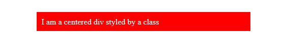
Figure: A div centered by a class
Multiple Classes
HTML elements can belong to more than one class.
To define multiple classes, separate the class names with a space, e.g.<div class="container green-bg">.
The element will be styled according to all the classes specified.
Thus we can add a new class green-bg which has a background attribute of green. We can create a div and assigned these two classes to the div. We will not have to style background because the green-bg attribute will take care of that. Thus our modified html code will be:
<!DOCTYPE html>
<html>
<head>
<style>
.container {
  width:400px;
  margin-right:auto;
  margin-left:auto;
}
.green-bg{
 background:green;
 color:#fff;
}
</style>
</head>
<body>
   <div class="container green-bg" style="padding:10px;">
    	I am a centered div styled by a class
    </div>
</body>
</html>

Figure: Div styled by two classes
Different Elements Can Share Same Class
Different HTML elements can point to the same class name. For example, if we want to center the menu we created and also center the content of our page, we can call the container class on both our menu and page content elements.
Thus a simple page with a menu will have html code like this:
<!DOCTYPE html>
<html>
<head>
<style>
.container {
  width:400px;
  margin-right:auto;
  margin-left:auto;
}
.green-bg{
 background:green;
 color:#fff;
}
ul {
  list-style-type: none;
  margin: 0;
  padding: 0;
  overflow: hidden;
  background-color:red;
}
ul.menu li{
   float:left;
}
li a {
  display: block;
  color: white;
  text-align: center;
  padding: 16px;
  text-decoration: none;
}

li a:hover {
  opacity:0.8;
}
</style>
</head>
<body>
	<div class="container">
	   <ul class="menu">
	      <li><a href="index.html">Home</a></li>
	      <li><a href="about.html">About Us</a></li>
	      <li><a href="services.html">Services</a></li>
	      <li><a href="contact.html">Contact Us</a></li>
	   </ul>
	</div>
	<div class="container green-bg" style="margin-top:20px;">
    	<div style="padding:10px;">My page content comes here</div>
    </div>
</body>
</html>

Figure: Simple page. Two divs referring to the same class
HTML The id Attribute
The HTML id attribute is used to specify a unique id for an HTML element.
You cannot have more than one element with the same id in an HTML document even though this is possible for attributes, javascript will not permit that because the id must be unique in order to know which of the elements a javascript syntax will affect.
Using The id Attribute
The id attribute specifies a unique id for an HTML element. The value of the id attribute must be unique within the HTML document.
The id attribute is used to point to a specific style declaration in a style sheet.It is also used by JavaScript to access and manipulate the element with the specific id.
The syntax for id is: write a hash character (#) character, followed by an id name.Then, define the CSS properties within curly braces {}.
Thus #nameOfId{}
We can modify our simple page code above to assign an id to the menu instead of a class.
Ids are referred in the element by the id keyword and the name of the id assigned.
Thus for instance <div id=”uniqueId”></div>
<!DOCTYPE html>
<html>
<head>
<style>
.container {
  width:400px;
  margin-right:auto;
  margin-left:auto;
}
.green-bg{
 background:green;
 color:#fff;
}
ul {
  list-style-type: none;
  margin: 0;
  padding: 0;
  overflow: hidden;
  background-color:red;
}
#menu li{
   float:left;
}
li a {
  display: block;
  color: white;
  text-align: center;
  padding: 16px;
  text-decoration: none;
}

li a:hover {
  opacity:0.8;
}
</style>
</head>
<body>
	<div class="container">
	     <ul id="menu">
		  <li><a href="index.html">Home</a></li>
		  <li><a href="about.html">About Us</a></li>
		  <li><a href="services.html">Services</a></li>
		  <li><a href="contact.html">Contact Us</a></li>
	    </ul>
	</div>
	<div class="container green-bg" style="margin-top:20px;">
    	<div style="padding:10px;">My page content comes here</div>
    </div>
</body>
</html>
Exercise
Create a profile page of yourself that looks like this:
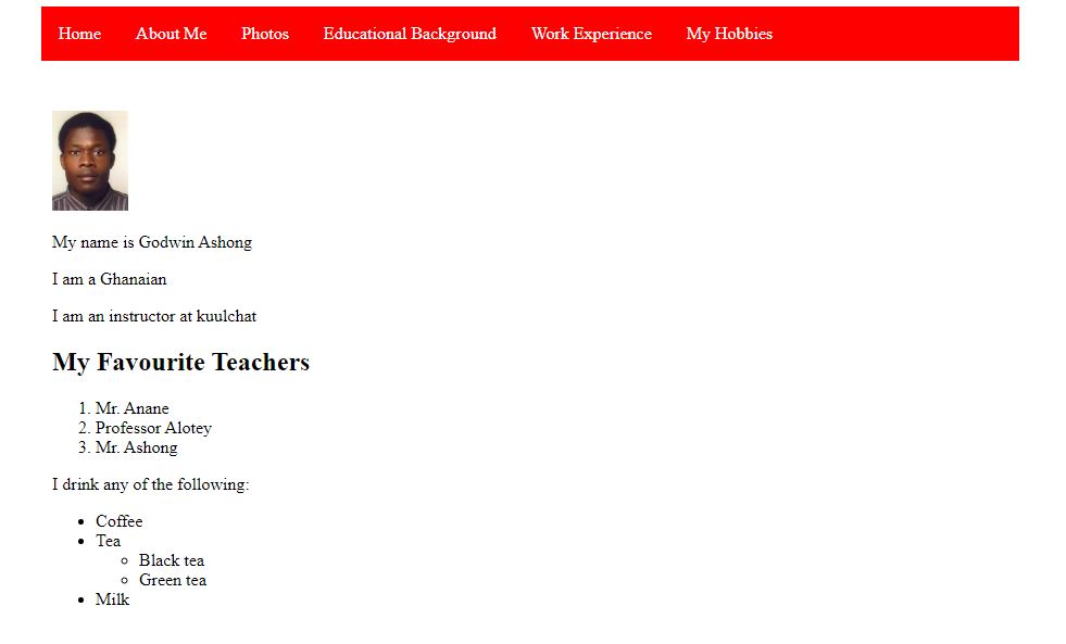
When any of the menu links is clicked, a new page should open with its content. For instance if the About Me menu is clicked, it should open about me page which talks more about yourself. When the Photos menu is clicked, it should show images of your photos and when the Educational Background menu is clicked, it should show your educational background


