Introduction To Dart Programming Language
- Overview
- Environment
- Variables
- Operators
Multiple Child Widgets
In this category, a given widget will have more than one child widgets and the layout of each widget is unique.
For example, Row widget allows the laying out of its children in horizontal direction, whereas Column widget allows laying out of its children in vertical direction. By composing Row and Column, widget with any level of complexity can be built.
Examples
Row − Allows to arrange its children in a horizontal manner.
Column − Allows to arrange its children in a vertical manner.
ListView − Allows to arrange its children as list.
GridView − Allows to arrange its children as gallery.
Expanded − Used to make the children of Row and Column widget to occupy the maximum possible area.
Table − Table based widget.
Flow − Flow based widget.
Stack − Stack based widget.
Syntax
layout widget ( children:[ children widgets come here ])
The children widgets are separated by a comma.
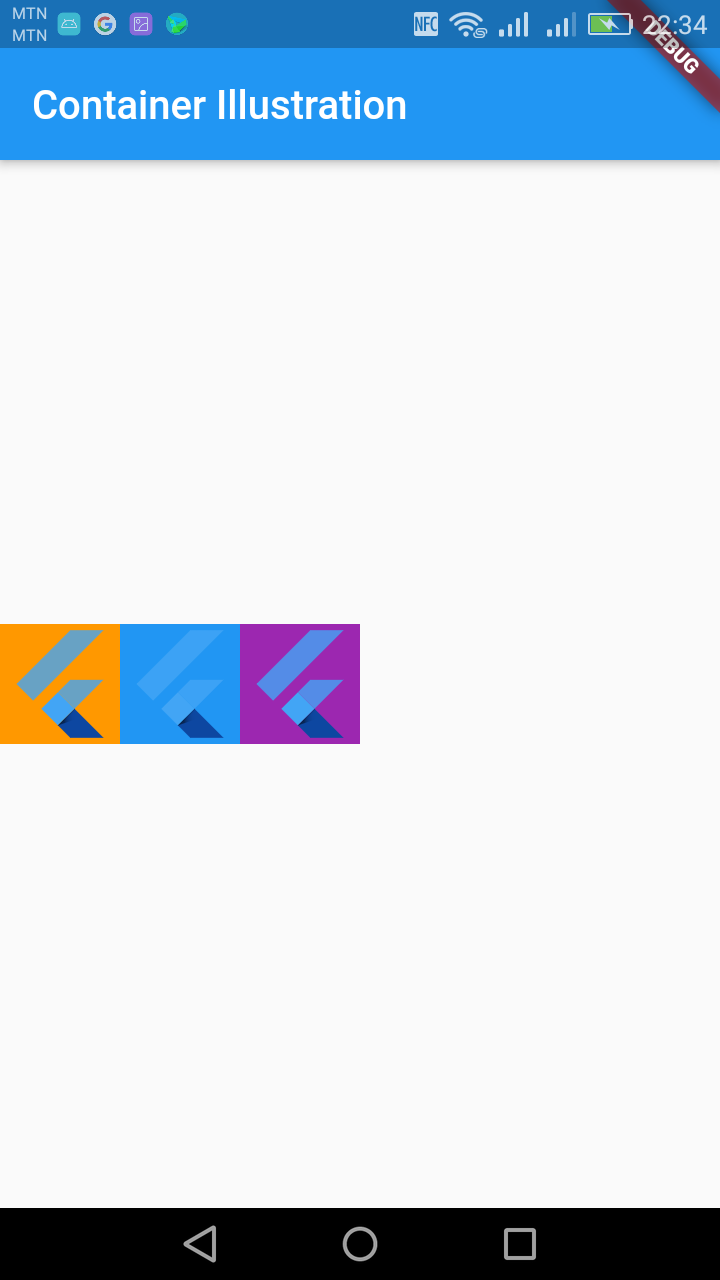
Row
A Row is a widget used to display child widgets in a horizontal manner. The Row widget does not scroll. If you have a line of widgets and want them to be able to scroll if there is insufficient room.
Example
import 'package:flutter/material.dart';

void main() => runApp(MyApp());

class MyApp extends StatelessWidget {
  @override
  Widget build(BuildContext context) {
    return MaterialApp(
      title: 'Welcome to Flutter',
      home: Scaffold(
        appBar: AppBar(
          title: Text('Container Illustration'),
        ),
        body: Center(
            child:Row(
              children: [
                Container(
                  color: Colors.orange,
                  child: FlutterLogo(
                    size: 60.0,
                  ),
                ),
                Container(
                  color: Colors.blue,
                  child: FlutterLogo(
                    size: 60.0,
                  ),
                ),
                Container(
                  color: Colors.purple,
                  child: FlutterLogo(
                    size: 60.0,
                  ),
                ),
              ],
            )
        ),
      ),
    );
  }
}
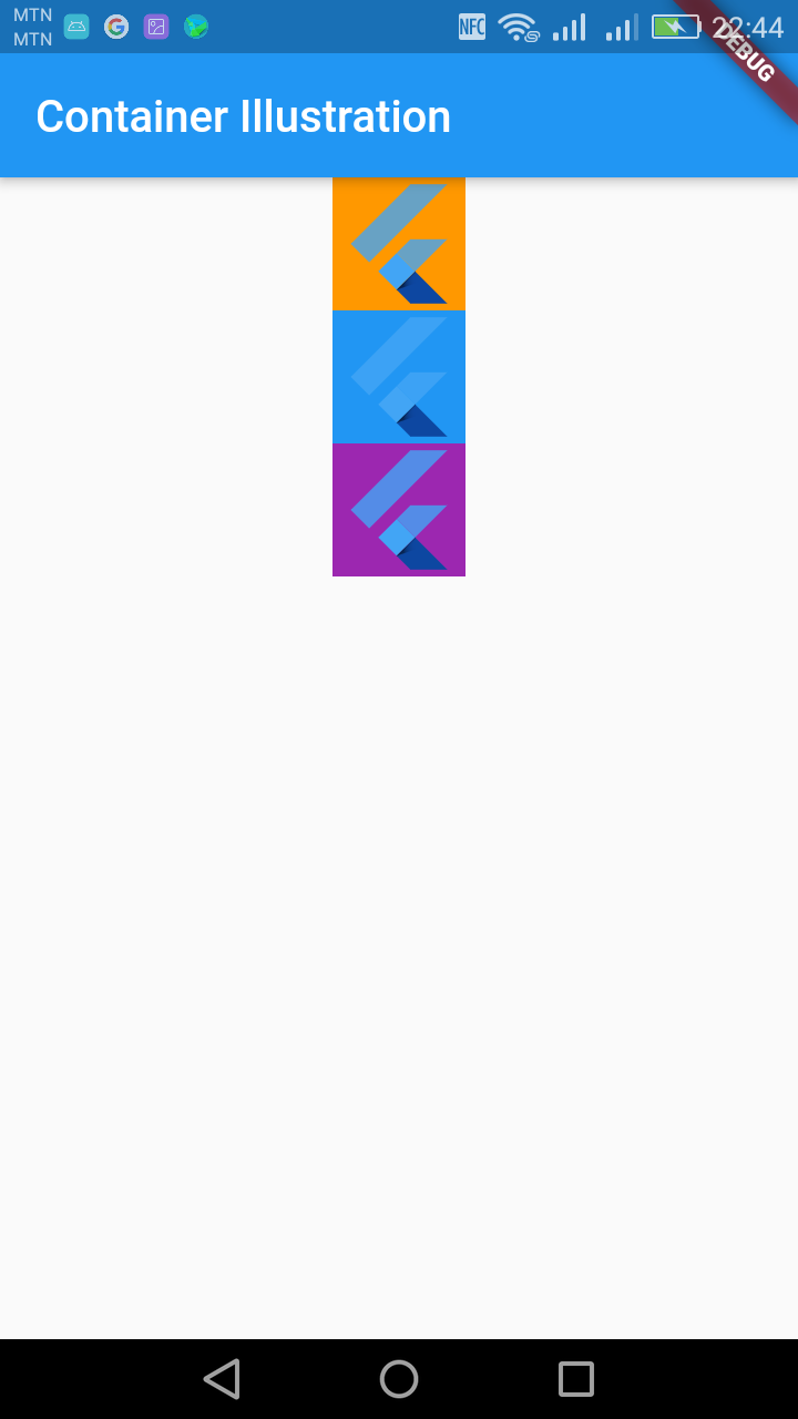
Column
A Column is a widget used to display child widgets in a vertical manner. The Column widget does not scroll. If you have a line of widgets and want them to be able to scroll if there is insufficient room
import 'package:flutter/material.dart';

void main() => runApp(MyApp());

class MyApp extends StatelessWidget {
  @override
  Widget build(BuildContext context) {
    return MaterialApp(
      title: 'Welcome to Flutter',
      home: Scaffold(
        appBar: AppBar(
          title: Text('Container Illustration'),
        ),
        body: Center(
            child:Column(
              children: [
                Container(
                  color: Colors.orange,
                  child: FlutterLogo(
                    size: 60.0,
                  ),
                ),
                Container(
                  color: Colors.blue,
                  child: FlutterLogo(
                    size: 60.0,
                  ),
                ),
                Container(
                  color: Colors.purple,
                  child: FlutterLogo(
                    size: 60.0,
                  ),
                ),
              ],
            )
        ),
      ),
    );
  }
}
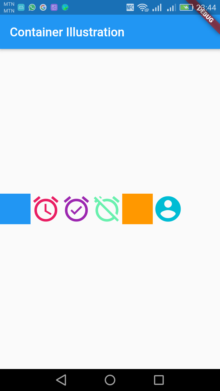
CrossAxisAlignment Propery
We can use the crossAxisAlignment property to align our child widget in the desired direction, for example, crossAxisAlignment.start would place the children with their start edge aligned with the start side of the cross axis.
Row
import 'package:flutter/material.dart';

void main() => runApp(MyApp());

class MyApp extends StatelessWidget {
  @override
  Widget build(BuildContext context) {
    return MaterialApp(
      title: 'Welcome to Flutter',
      home: Scaffold(
        appBar: AppBar(
          title: Text('Container Illustration'),
        ),
        body: Center(
            child:Row(
              crossAxisAlignment: CrossAxisAlignment.start,
              children: [
                Container(
                  color: Colors.blue,
                  height: 50.0,
                  width: 50.0,
                ),
                Icon(Icons.alarm, size: 50.0, color: Colors.pink),
                Icon(Icons.alarm_on, size: 50.0, color: Colors.purple,),
                Icon(Icons.alarm_off, size: 50.0, color: Colors.greenAccent,),
                Container(
                  color: Colors.orange,
                  height: 50.0,
                  width: 50.0,
                ),
                Icon(Icons.account_circle, size: 50.0, color: Colors.cyan,),
              ],
            )
        ),
      ),
    );
  }
}
Column
import 'package:flutter/material.dart';

void main() => runApp(MyApp());

class MyApp extends StatelessWidget {
  @override
  Widget build(BuildContext context) {
    return MaterialApp(
      title: 'Welcome to Flutter',
      home: Scaffold(
        appBar: AppBar(
          title: Text('Container Illustration'),
        ),
        body: Center(
            child:Column(
              crossAxisAlignment: CrossAxisAlignment.start,
              children: [
                Container(
                  color: Colors.blue,
                  height: 50.0,
                  width: 50.0,
                ),
                Icon(Icons.alarm, size: 50.0, color: Colors.pink),
                Icon(Icons.alarm_on, size: 50.0, color: Colors.purple,),
                Icon(Icons.alarm_off, size: 50.0, color: Colors.greenAccent,),
                Container(
                  color: Colors.orange,
                  height: 50.0,
                  width: 50.0,
                ),
                Icon(Icons.account_circle, size: 50.0, color: Colors.cyan,),
              ],
            )
        ),
      ),
    );
  }
}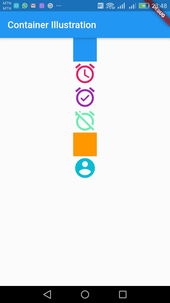
Other CrossAxisAlignment properties include end, center and baseline.
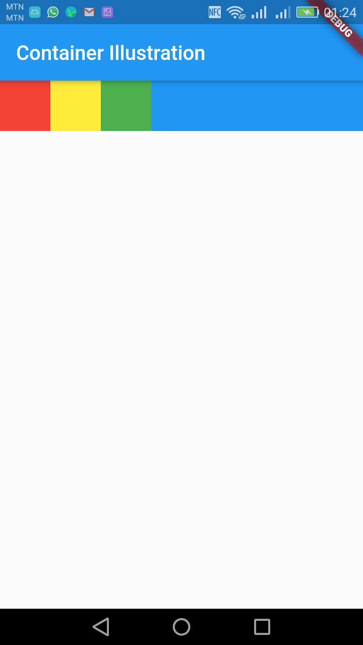
Expanded
A widget that expands a child of a Row, Column, or Flex so that the child fills the available space.
Using an Expanded widget makes a child of a Row, Column, or Flex expand to fill the available space along the main axis (e.g., horizontally for a Row or vertically for a Column). If multiple children are expanded, the available space is divided among them according to the flex factor.
An Expanded widget must be a descendant of a Row, Column, or Flex, and the path from the Expanded widget to its enclosing Row, Column, or Flex must contain only StatelessWidgets or StatefulWidgets
import 'package:flutter/material.dart';
void main() => runApp(MyApp());
class MyApp extends StatelessWidget {
@override
Widget build(BuildContext context) {
return MaterialApp(
title: 'Welcome to Flutter',
home: Scaffold(
appBar: AppBar(
title: Text('Container Illustration'),
),
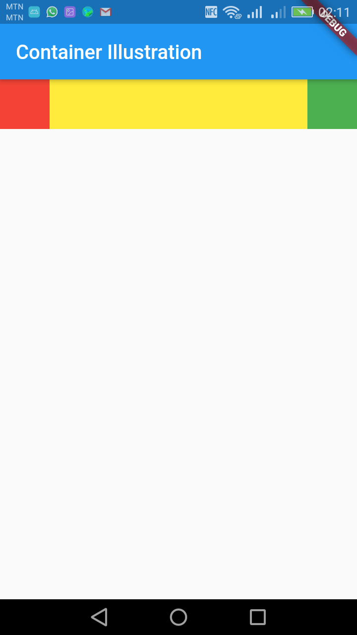
body: Container(
color:Colors.blue,
child:Row(
children: [
Container(
color: Colors.red,
height: 50.0,
width: 50.0,
),
Container(
color: Colors.yellow,
height: 50.0,
width: 50.0,
),
Container(
color: Colors.green,
height: 50.0,
width: 50.0,
),
],
)
),
),
);
}
}
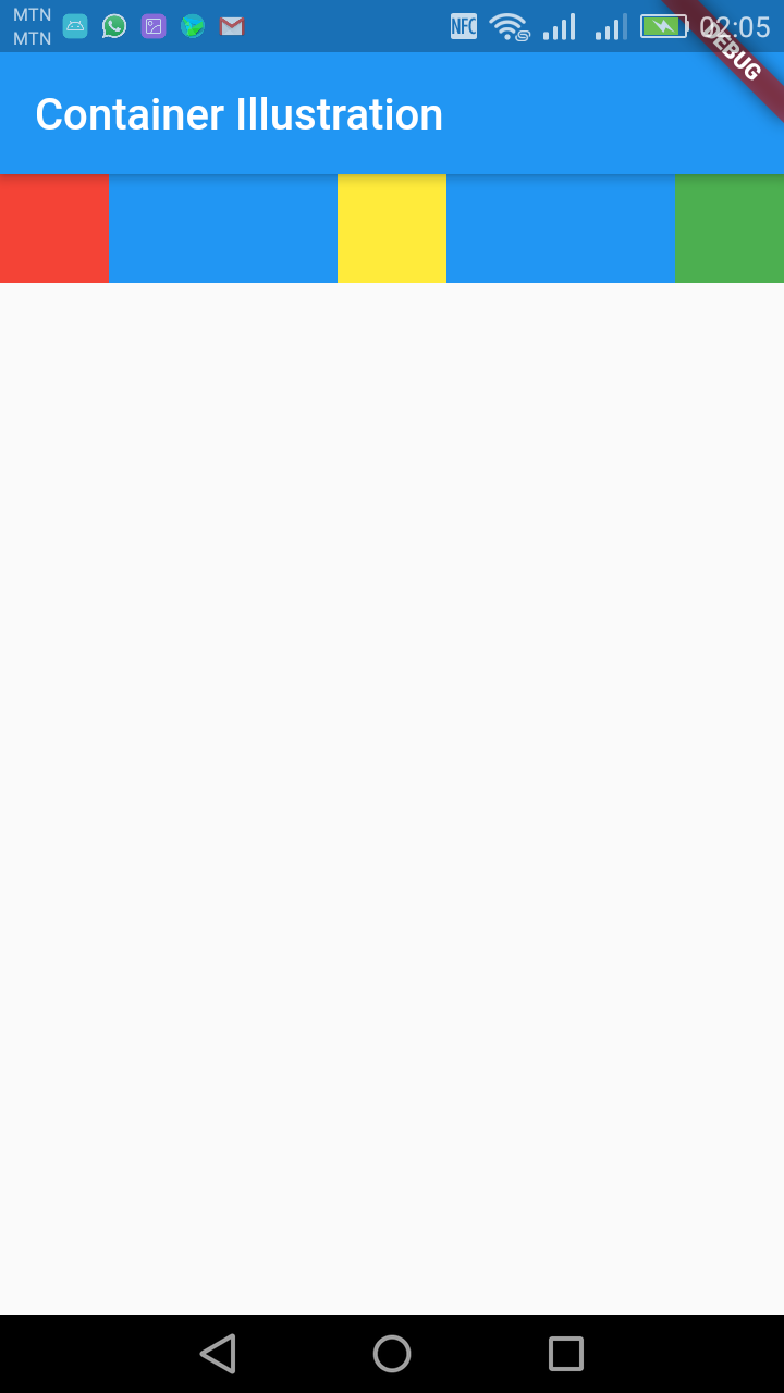
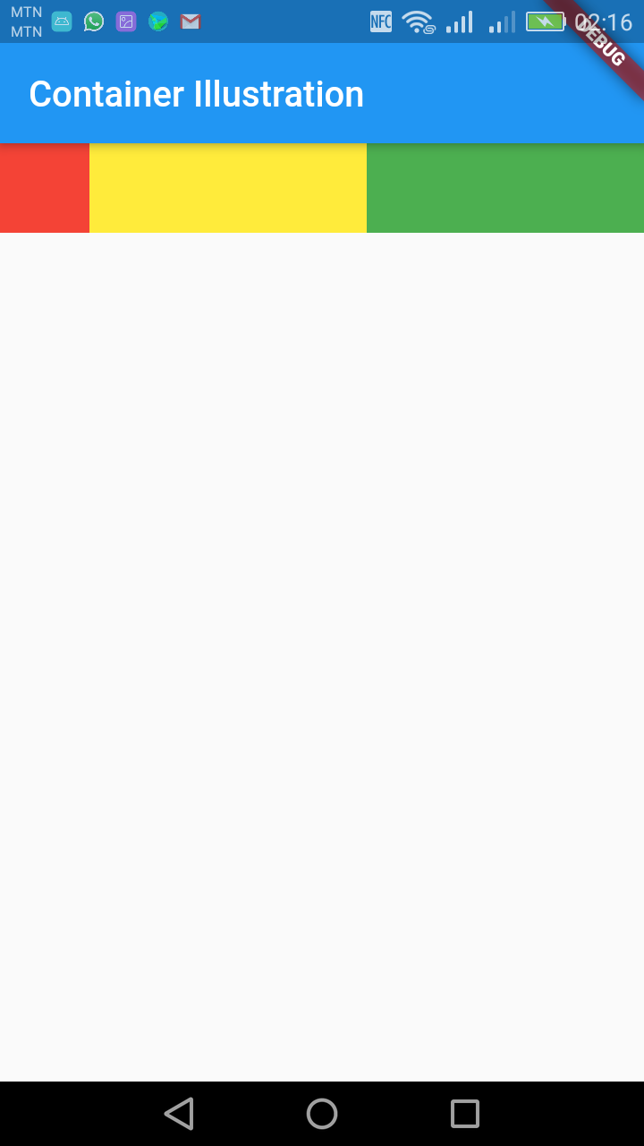
To evenly space between the widgets in the row use the property below:
mainAxisAlignment: MainAxisAlignment.spaceBetween,import 'package:flutter/material.dart';
void main() => runApp(MyApp());
class MyApp extends StatelessWidget {
@override
Widget build(BuildContext context) {
return MaterialApp(
title: 'Welcome to Flutter',
home: Scaffold(
appBar: AppBar(
title: Text('Container Illustration'),
),
body: Container(
color:Colors.blue,
child:Row(
mainAxisAlignment: MainAxisAlignment.spaceBetween,
children: [
Container(
color: Colors.red,
height: 50.0,
width: 50.0,
),
Container(
color: Colors.yellow,
height: 50.0,
width: 50.0,
),
Container(
color: Colors.green,
height: 50.0,
width: 50.0,
),
],
)
),
),
);
}
}
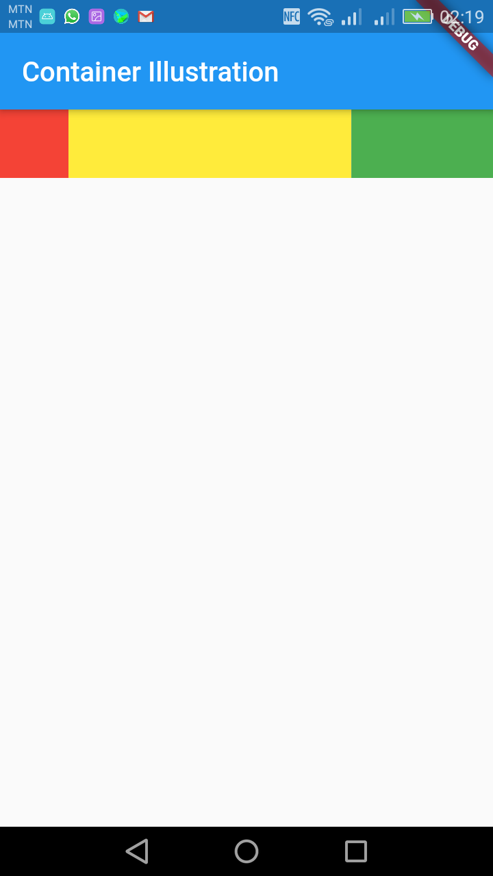
If you want one of the widgets to expand to fill the extra space in the row or column, you can wrap it with an Expanded widget:
import 'package:flutter/material.dart';

void main() => runApp(MyApp());

class MyApp extends StatelessWidget {
  @override
  Widget build(BuildContext context) {
    return MaterialApp(
      title: 'Welcome to Flutter',
      home: Scaffold(
        appBar: AppBar(
          title: Text('Container Illustration'),
        ),
        body: Container(
          color:Colors.blue,
            child:Row(
              mainAxisAlignment: MainAxisAlignment.spaceBetween,
              children: [
                Container(
                  color: Colors.red,
                  height: 50.0,
                  width: 50.0,
                ),

                Expanded(
                    child:Container(
                  color: Colors.yellow,
                  height: 50.0,
                  width: 50.0,
                )),

                Container(
                  color: Colors.green,
                  height: 50.0,
                  width: 50.0,
                ),

              ],
            )
        ),
      ),
    );
  }
}
Multiple Expanded
The expanded widgets share the extra space equally.
import 'package:flutter/material.dart';

void main() => runApp(MyApp());

class MyApp extends StatelessWidget {
  @override
  Widget build(BuildContext context) {
    return MaterialApp(
      title: 'Welcome to Flutter',
      home: Scaffold(
        appBar: AppBar(
          title: Text('Container Illustration'),
        ),
        body: Container(
          color:Colors.blue,
            child:Row(
              mainAxisAlignment: MainAxisAlignment.spaceBetween,
              children: [
                Container(
                  color: Colors.red,
                  height: 50.0,
                  width: 50.0,
                ),

                Expanded(
                    child:Container(
                  color: Colors.yellow,
                  height: 50.0,
                  width: 50.0,
                )),

                Expanded(
                  child:Container(
                      color: Colors.green,
                      height: 50.0,
                      width: 50.0,
                    ),
                )
              ],
            )
        ),
      ),
    );
  }
}
If you have a couple widgets that you want to share the extra space (but not equally) you can set the flex factor: The one with the higher flex factor takes bigger space.
import 'package:flutter/material.dart';

void main() => runApp(MyApp());

class MyApp extends StatelessWidget {
  @override
  Widget build(BuildContext context) {
    return MaterialApp(
      title: 'Welcome to Flutter',
      home: Scaffold(
        appBar: AppBar(
          title: Text('Container Illustration'),
        ),
        body: Container(
          color:Colors.blue,
            child:Row(
              mainAxisAlignment: MainAxisAlignment.spaceBetween,
              children: [
                Container(
                  color: Colors.red,
                  height: 50.0,
                  width: 50.0,
                ),

                Expanded(
                    flex:2,
                    child:Container(
                  color: Colors.yellow,
                  height: 50.0,
                  width: 50.0,
                )),

                Expanded(
                  flex:1,
                  child:Container(
                      color: Colors.green,
                      height: 50.0,
                      width: 50.0,
                    ),
                )
              ],
            )
        ),
      ),
    );
  }
}
NAVIGATION GUI
Bottom Navigation
A material widget that's displayed at the bottom of an app for selecting among a small number of views, typically between three and five.
The bottom navigation bar consists of multiple items in the form of text labels, icons, or both, laid out on top of a piece of material. It provides quick navigation between the top-level views of an app. For larger screens, side navigation may be a better fit.
A bottom navigation bar is usually used in conjunction with a Scaffold, where it is provided as the Scaffold.bottomNavigationBar argument.
The bottom navigation bar's type changes how its items are displayed. If not specified, then it's automatically set to BottomNavigationBarType.fixed when there are less than four items, and BottomNavigationBarType.shifting otherwise.
BottomNavigationBarType.fixed, the default when there are less than four items. The selected item is rendered with the selectedItemColor if it's non-null, otherwise the theme's ThemeData.primaryColor is used. If backgroundColor is null, The navigation bar's background color defaults to the Material background color, ThemeData.canvasColor (essentially opaque white).
BottomNavigationBarType.shifting, the default when there are four or more items. If selectedItemColor is null, all items are rendered in white. The navigation bar's background color is the same as the BottomNavigationBarItem.backgroundColor of the selected item. In this case it's assumed that each item will have a different background color and that background color will contrast well with white.
Constructors
BottomNavigationBar({Key key, @required List items, ValueChanged onTap, int currentIndex: 0, double elevation, BottomNavigationBarType type, Color fixedColor, Color backgroundColor, double iconSize: 24.0, Color selectedItemColor, Color unselectedItemColor, IconThemeData selectedIconTheme, IconThemeData unselectedIconTheme, double selectedFontSize: 14.0, double unselectedFontSize: 12.0, TextStyle selectedLabelStyle, TextStyle unselectedLabelStyle, bool showSelectedLabels: true, bool showUnselectedLabels, MouseCursor mouseCursor})
Creates a bottom navigation bar which is typically used as a Scaffold's Scaffold.bottomNavigationBar argument. [...]
Properties
backgroundColor → Color
The color of the BottomNavigationBar itself. [...]
currentIndex → int
The index into items for the current active BottomNavigationBarItem.
elevation → double
The z-coordinate of this BottomNavigationBar. [...]
fixedColor → Color
The value of selectedItemColor. [...]
iconSize → double
The size of all of the BottomNavigationBarItem icons. [...]
items → List
Defines the appearance of the button items that are arrayed within the bottom navigation bar.
key → Key
Controls how one widget replaces another widget in the tree. [...]
mouseCursor → MouseCursor
The cursor for a mouse pointer when it enters or is hovering over the tiles. [...]
onTap → ValueChanged
Called when one of the items is tapped. [...]
runtimeType → Type
A representation of the runtime type of the object.
selectedFontSize → double
The font size of the BottomNavigationBarItem labels when they are selected. [...]
selectedIconTheme → IconThemeData
The size, opacity, and color of the icon in the currently selected BottomNavigationBarItem.icon. [...]
selectedItemColor → Color
The color of the selected BottomNavigationBarItem.icon and BottomNavigationBarItem.label. [...]
selectedLabelStyle → TextStyle
The TextStyle of the BottomNavigationBarItem labels when they are selected.
showSelectedLabels → bool
Whether the labels are shown for the unselected BottomNavigationBarItems.
showUnselectedLabels → bool
Whether the labels are shown for the selected BottomNavigationBarItem.
type → BottomNavigationBarType
Defines the layout and behavior of a BottomNavigationBar. [...]
unselectedFontSize → double
The font size of the BottomNavigationBarItem labels when they are not selected. [...]
unselectedIconTheme → IconThemeData
The size, opacity, and color of the icon in the currently unselected BottomNavigationBarItem.icons [...]
unselectedItemColor → Color
The color of the unselected BottomNavigationBarItem.icon and BottomNavigationBarItem.labels. [...]
unselectedLabelStyle → TextStyle
The TextStyle of the BottomNavigationBarItem labels when they are not selected.
Step 1.
Import the material design package in the class that will have the bottom navigation. If the bottom navigation will be your home page, you can have it in the main.dart class
import 'package:flutter/material.dart';
Step 2.
Your bottomNavigationBar must be in a class which extends State in order to be able to call the setState() method which updates the screen anytime something changes. The setState() method can't be called in a class which extends a StatelessWidget or StatefullWidget.
Your class which extends a StatefullWidget must therefore have object of a class which extends State. The class which extends State will contain your bottomNavigationBar.
Step 3.
Create an int global variable in the class with the bottomNavigationBar which will contain the value of the selected navigation tab. The first tab is 0, second is 1, third is 2 and so on. You must therefore initialize this variable to 0 since the first tab is selected by default when the application starts.
Step 4
Create a method in the class with the navigation bar which takes int data type as its argument. This method sets the value of the global variable which contains the selected tab value. The setting of the value is done in the setState() method as shown in the example below. This method is called on the onTab key of the bottomNagivationBar constructor. The example code below demonstrates the above explanations.
Example
import 'package:flutter/material.dart';
void main() => runApp(MyApp());
/// This Widget is the main application widget.
class MyApp extends StatelessWidget {
static const String _title = 'Kuulchat Flutter Tutorials';
@override
Widget build(BuildContext context) {
return MaterialApp(
title: _title,
home: MyAppStatefulWidget(),
);
}
}
class MyAppStatefulWidget extends StatefulWidget {
MyAppStatefulWidget({Key key}) : super(key: key);
@override
_MyApp createState() => _MyApp();
}
class _MyApp extends State{
int _currentIndex = 0;
@override
Widget build(BuildContext context) {
return MaterialApp(
title: 'Kuulchat Flutter Tutorials',
home: Scaffold(
appBar: AppBar(
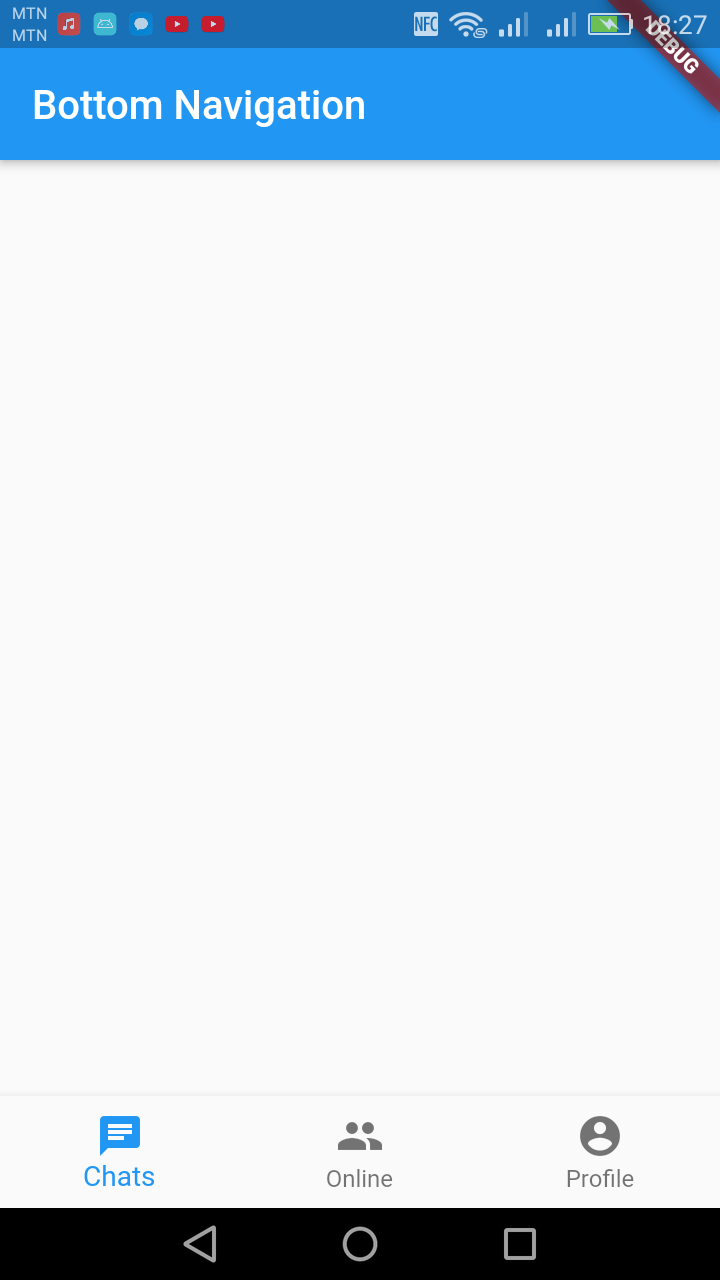
title: Text('Bottom Navigation'),
),
bottomNavigationBar: BottomNavigationBar(
currentIndex: _currentIndex,
onTap: tabSelected,// this will be set when a new tab is tapped
items: [
BottomNavigationBarItem(
icon: new Icon(Icons.chat),
title: new Text('Chats'),
),
BottomNavigationBarItem(
icon: new Icon(Icons.group),
title: new Text('Online'),
),
BottomNavigationBarItem(
icon: Icon(Icons.account_circle),
title: Text('Profile')
)
],
),
),
);
}
void tabSelected(int index) {
setState(() {
_currentIndex = index;
});
}
}In the above example, the global variable for setting the selected tab is _currentIndex which is initialized to 0.
The navigation items has an icon and a title. If your bottom navigation will only contain an icon or a text, you can set only one.
The method which updates the selected tab is the tabSelected and this is called on the onTab key of the bottomNavigationBar constructor.
Step 5
Create a widget class for each of the tab content. If your class is in a different dart file import it. But you can have this class in the same file you have the bottomNavigation if you wish.
But for bigger project, it will be better to create different dart files in the lib folder for each of the tab classes in order to make code maintenance easier.
Step 6
Create a widget array (List<Widget>) global variable which will contain the classes for each of the tab at their appropriate indexes. For example the above tab has Chats, Online and Profile tabs. My widget array at index 0 will contain the Chats widget class, index 1 will contain the Online widget class and index 2 will contain the Profile class.
Step 7
In the body of your widget which contains the bottomNavigationBar, set the widget array variable at an index of the tab. The tab index is the global variable you declared for the selected tab. So that if the first tab is tabbed, the body will contain the widget class at index 0 and if the second tab is tabbed, the body will contain the widget class at index 1 and if the third tab is tabbed, the body will contain the widget class at index 2 and so on.
Example
home.dart
import 'package:flutter/material.dart';

class Home extends StatelessWidget {
  @override
  Widget build(BuildContext context) {
    return Center(
        child:Container(
        child: Text("Chat content widgets come here"),
          ),
    );
  }
}
online.dart
import 'package:flutter/material.dart';

class Online extends StatelessWidget {
  @override
  Widget build(BuildContext context) {
    return Center(
      child:Container(
        child: Text("Online content widgets come here"),
      ),
    );
  }
}
profile.dart
import 'package:flutter/material.dart';

class Profile extends StatelessWidget {
  @override
  Widget build(BuildContext context) {
    return Center(
      child:Container(
        child: Text("Profile content widgets come here"),
      ),
    );
  }
}
main.dart
import 'package:flutter/material.dart';
import 'home.dart';
import 'online.dart';
import 'profile.dart';
void main() => runApp(MyApp());

/// This Widget is the main application widget.
class MyApp extends StatelessWidget {
  static const String _title = 'Kuulchat Flutter Tutorials';
  @override
  Widget build(BuildContext context) {
    return MaterialApp(
      title: _title,
      home: MyAppStatefulWidget(),
    );
  }
}
class MyAppStatefulWidget extends StatefulWidget {
  MyAppStatefulWidget({Key key}) : super(key: key);

  @override
  _MyApp createState() => _MyApp();
}
class _MyApp extends State{
  int _currentIndex = 0;
  final List<Widget> _children = [
    Home(),
    Online(),
    Profile()
  ];
  @override
  Widget build(BuildContext context) {
    return MaterialApp(
      title: 'Kuulchat Flutter Tutorials',
      home: Scaffold(
        appBar: AppBar(
          title: Text('Bottom Navigation'),
        ),
        body:_children[_currentIndex],
        bottomNavigationBar: BottomNavigationBar(
          currentIndex: _currentIndex,
          onTap: tabSelected, // this will be set when a new tab is tapped
          items: [
            BottomNavigationBarItem(
              icon: new Icon(Icons.chat),
              title: new Text('Chats'),
            ),
            BottomNavigationBarItem(
              icon: new Icon(Icons.group),
              title: new Text('Online'),
            ),
            BottomNavigationBarItem(
                icon: Icon(Icons.account_circle),
                title: Text('Profile')
            )
          ],
        ),
      ),
    );
  }
  void tabSelected(int index) {
    setState(() {
      _currentIndex = index;
    });
  }
}
NOTE:
To create a new dart file, right click on the lib folder in your android studio and select New → Dart File and then enter the name of the dart file.
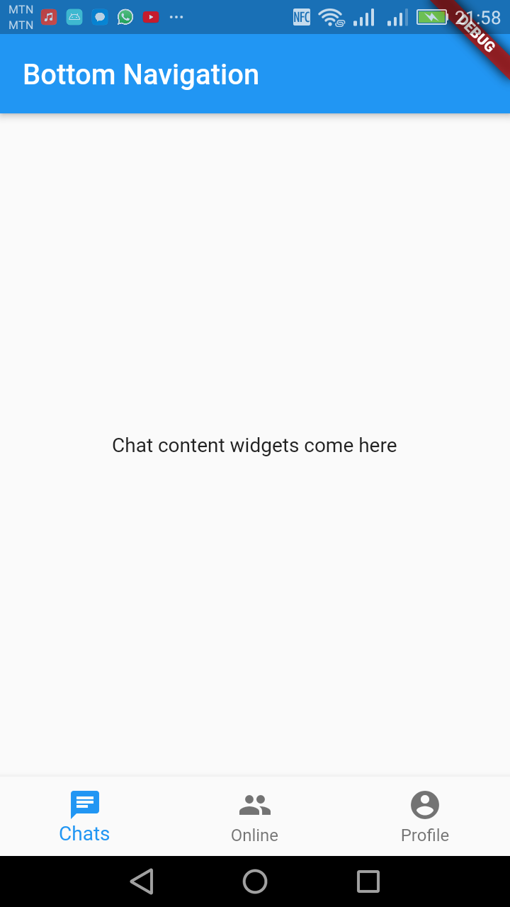
Figure: Home tab
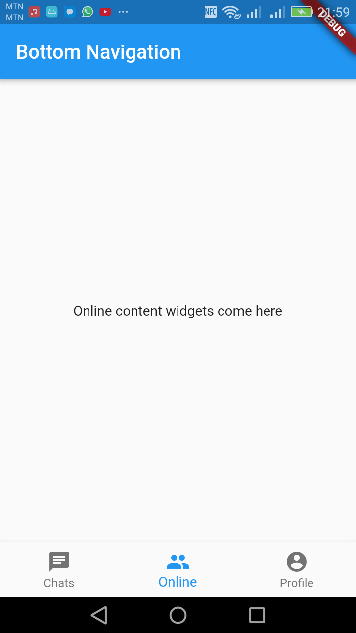
Figure: Online tab tabbed
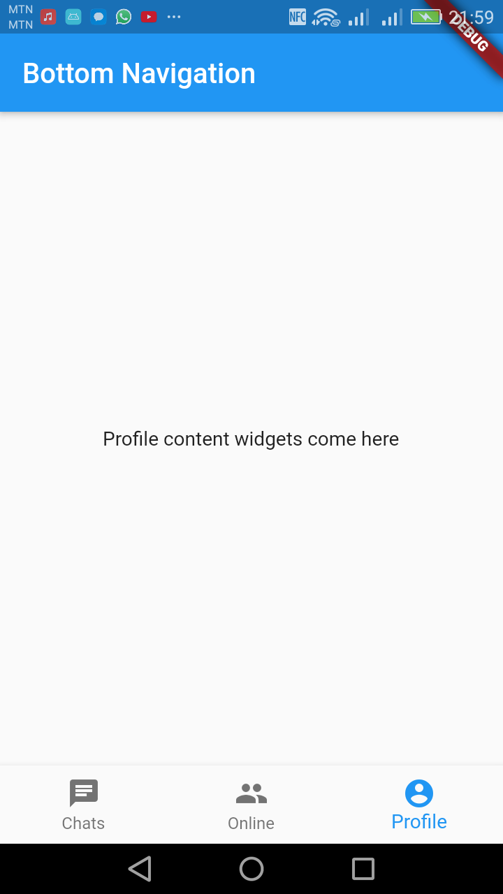
Figure: Profile tab tabbed


Digital Address: GZ-033-0057
King Kotey Road
Teshie - Accra
Ghana
+233 54 753 9118
info@kuulchat.com
© Copyright 2015 - 2026
All Rights Reserved