Display block & inline-block
The display attribute with a block value covers the entire width (space) unline the inline-block which covers a part of the space and other elements (div) can as well continue. The inline-block displays the elements in a horizontal while display block display them vertical since one element takes the entire space.
Examples
LIST WITH DISPLAY BLOCK AND INLINE BLOCK
<!DOCTYPE html>
<html>
	<head>
		<meta charset="ISO-8859-1">
		<meta name="description" content="Web programming tutorials" />
		<meta name="keywords" content="Introduction to PHP, PHP Programming" />
		<title>Display Attribute</title>
		<link rel="shortcut icon" type="image/x-icon" href="images/icon.ico" />
		<!-- Commenting in html -->
		<!-- External CSS Sheet -->
		<link rel="stylesheet" href="css/style.css" />
		<style>
			ul.menu li{
				display:block;
			}
			ul.menu_2 li{
				display: inline-block;
			}
		</style>
	</head>
	<body>
		<ul class="menu">
			<li>Home</li>
			<li>About Us</li>
			<li>Our Services</li>
			<li>Contact Us</li>
		</ul>
		<ul class="menu_2">
			<li>Home</li>
			<li>About Us</li>
			<li>Our Services</li>
			<li>Contact Us</li>
		</ul>
	</body>
</html>
DIVs WITH DISPLAY BLOCK AND INLINE BLOCK
<!DOCTYPE html>
<html>
	<head>
		<meta charset="ISO-8859-1">
		<meta name="description" content="Web programming tutorials" />
		<meta name="keywords" content="Introduction to PHP, PHP Programming" />
		<title>Display Attribute</title>
		<link rel="shortcut icon" type="image/x-icon" href="images/icon.ico" />
		<!-- Commenting in html -->
		<!-- External CSS Sheet -->
		<link rel="stylesheet" href="css/style.css" />
		<style>

		</style>
	</head>
	<body>
		<div style="background:yellow;display:block;height:20px;"></div>
		<div style="background:red;display:block;height:20px;"></div>
		<div style="background:yellow;display:inline-block;width:48%;height:20px;"></div>
		<div style="background:red;display:inline-block;width:48%;height:20px;float:right;"></div>
	</body>
</html>
CSS Layout - The position Property
The position property specifies the type of positioning method used for an element.
There are five different position values:
- static
- relative
- fixed
- absolute
- sticky
Elements are then positioned using the top, bottom, left, and right properties.
position: static;
HTML elements are positioned static by default.
Static positioned elements are not affected by the top, bottom, left, and right properties.
An element with position: static; is not positioned in any special way; it is always positioned according to the normal flow of the page:
<!DOCTYPE html>
<html>
<head>
<style>
div.static {
  position: static;
  border: 3px solid #73AD21;
}
</style>
</head>
<body>

<h2>position: static;</h2>

<div class="static">
  This div has position: static;
</div>

</body>
</html>
position: relative;
An element with position: relative; is positioned relative to its normal position.
Setting the top, right, bottom, and left properties of a relatively-positioned element will cause it to be adjusted away from its normal position.
Other content will not be adjusted to fit into any gap left by the element.
<!DOCTYPE html>
<html>
<head>
<style>
div.relative {
  position: relative;
  left: 30px;
  top:400px;
  border: 3px solid #73AD21;
}
</style>
</head>
<body>

<h2>position: relative;</h2>

<div class="relative">
This div element has position: relative;
</div>

</body>
</html>
position: fixed;
An element with position: fixed; is positioned relative to the viewport, which means it always stays in the same place even if the page is scrolled. The top, right, bottom, and left properties are used to position the element.
A fixed element does not leave a gap in the page where it would normally have been located.
Example
<!DOCTYPE html>
<html>
<head>
<style>
div.fixed {
  position: fixed;
  top:0;
  left:0;
  bottom: 0;
  right: 0;
  width: 300px;
  border: 3px solid #73AD21;
  background:#f0f0f0;
}
</style>
</head>
<body>

<h2>position: fixed;</h2>

<div class="fixed">
This div element has position: fixed;
</div>

</body>
</html>
Note
If you make a div fixed especially header of a page, some of the page content below will be covered by the fixed div. You will have to place another div immediately below the fixed div and give it a reasonable height so that the other div which is being covered by the fixed div become visible.
Examples
Without a pushing div
<html>
	<head>
		<meta charset="ISO-8859-1">
		<meta name="description" content="Kuulchat.com" />
		<meta name="keywords" content="Kuulchat" />
		<title>Compu-Train</title>
		<link rel="shortcut icon" type="image/x-icon" href="images/icon.ico" />
		<style>
			body,div,p,ul{
				margin:0px;
				padding:0px;
			}
			.header{
			  background:#fc0;
			  position:fixed;
			  width:100%;
			  z-index:2;
			}
			a{
				text-decoration:none;
			}
			ul{
			  list-style:none;
			}
			.menu li{
			    display:inline-block;
			}
			.menu li a{
				color:#FFFFFF;
				display:block;
				padding:10px 20px 10px 20px;
			}
			.logo-box{
				display:inline-block;
				vertical-align:top;
				padding: 8px 0px 4px 0px;
			}
			.menu-box{
				display:inline-block;
				vertical-align:top;
			}
			.container{
			    width:1200px;
				margin-left:auto;
				margin-right:auto;
			}
		</style>
	</head>
	<body>
		<div class="header">
			<div class="container">
				<div class="logo-box">
					<a href="" class="logo"><img src="https://kuulchat.com/images/logo.png" width="35" /></a>
				</div>
				<div class="menu-box">
					<ul class="menu">
						<li><a href="">Home</a></li>
						<li><a href="">About Us</a></li>
						<li><a href="">Our Services</a></li>
						<li><a href="">Contact Us</a></li>
					</ul>
				</div>
			</div>
		</div>
		<div class="container">
			<p>Kuulchat is an educational resource portal for people of all walks of life.</p>
			<p>You can learn or socialize on the site.</p>
		</div>
	</body>
</html>
You will realize that the text below the header is covered by the fixed header. To rectify that, a div by class push is placed below the header in the code below. Take note of the push class and where the push div is placed.
<html>
	<head>
		<meta charset="ISO-8859-1">
		<meta name="description" content="Kuulchat.com" />
		<meta name="keywords" content="Kuulchat" />
		<title>Compu-Train</title>
		<link rel="shortcut icon" type="image/x-icon" href="images/icon.ico" />
		<style>
			body,div,p,ul{
				margin:0px;
				padding:0px;
			}
			.header{
			  background:#fc0;
			  position:fixed;
			  width:100%;
			  z-index:2;
			}
			.push{
			   height:45px;
			}
			a{
				text-decoration:none;
			}
			ul{
			  list-style:none;
			}
			.menu li{
			    display:inline-block;
			}
			.menu li a{
				color:#FFFFFF;
				display:block;
				padding:10px 20px 10px 20px;
			}
			.logo-box{
				display:inline-block;
				vertical-align:top;
				padding: 8px 0px 4px 0px;
			}
			.menu-box{
				display:inline-block;
				vertical-align:top;
			}
			.container{
			    width:1200px;
				margin-left:auto;
				margin-right:auto;
			}
		</style>
	</head>
	<body>
		<div class="header">
			<div class="container">
				<div class="logo-box">
					<a href="" class="logo"><img src="https://kuulchat.com/images/logo.png" width="35" /></a>
				</div>
				<div class="menu-box">
					<ul class="menu">
						<li><a href="">Home</a></li>
						<li><a href="">About Us</a></li>
						<li><a href="">Our Services</a></li>
						<li><a href="">Contact Us</a></li>
					</ul>
				</div>
			</div>
		</div>
		<div class="push"></div>
		<div class="container">
			<p>Kuulchat is an educational resource portal for people of all walks of life.</p>
			<p>You can learn or socialize on the site.</p>
		</div>
	</body>
</html>
position: absolute;
An element with position: absolute; is positioned relative to the nearest positioned ancestor (instead of positioned relative to the viewport, like fixed).
However; if an absolute positioned element has no positioned ancestors, it uses the document body, and moves along with page scrolling.
Note: A "positioned" element is one whose position is anything except static.
Here is a simple example:
Example
<html>
<head>
<style>
div.relative {
  position: relative;
  width: 400px;
  height: 200px;
  border: 3px solid #73AD21;
}

div.absolute {
  position: absolute;
  top: 20px;
  left: 0;
  width: 200px;
  height: 100px;
  border: 3px solid #73AD21;
}
</style>
</head>
<body>

<h2>position: absolute;</h2>

<div class="relative">
    <input type="text" id="search" style="width:200px" />
    <div class="absolute">
        <ul>
            <li>Result 1</li>
            <li>Result 2</li>
            <li>Result 3</li>
            <li>Result 4</li>
        </ul>
    </div>
    <p>This div element has position: relative;</p>
    <p>An element with position: absolute; is positioned relative to the nearest positioned ancestor (instead of positioned relative to the viewport, like fixed):
    </p>
</div>

</body>
</html>
position: sticky;
An element with position: sticky; is positioned based on the user's scroll position.
A sticky element toggles between relative and fixed, depending on the scroll position. It is positioned relative until a given offset position is met in the viewport - then it "sticks" in place (like position:fixed).
Note: Internet Explorer, Edge 15 and earlier versions do not support sticky positioning. Safari requires a -webkit- prefix (see example below). You must also specify at least one of top, right, bottom or left for sticky positioning to work.
Example
<!DOCTYPE html>
<html>
<head>
<style>
div.sticky {
  position: -webkit-sticky;
  position: sticky;
  top: 0;
  padding: 5px;
  background-color: #cae8ca;
  border: 2px solid #4CAF50;
}
</style>
</head>
<body>

<p>Try to <b>scroll</b> inside this frame to understand how sticky positioning works.</p>
<p>Note: IE/Edge 15 and earlier versions do not support sticky position.</p>

<div class="sticky">I am sticky!</div>

<div style="padding-bottom:2000px">
  <p>In this example, the sticky element sticks to the top of the page (top: 0), when you reach its scroll position.</p>
  <p>Scroll back up to remove the stickyness.</p>
  <p>Some text to enable scrolling.. Lorem ipsum dolor sit amet, illum definitiones no quo, maluisset concludaturque et eum, altera fabulas ut quo. Atqui causae gloriatur ius te, id agam omnis evertitur eum. Affert laboramus repudiandae nec et. Inciderint efficiantur his ad. Eum no molestiae voluptatibus.</p>
  <p>Some text to enable scrolling.. Lorem ipsum dolor sit amet, illum definitiones no quo, maluisset concludaturque et eum, altera fabulas ut quo. Atqui causae gloriatur ius te, id agam omnis evertitur eum. Affert laboramus repudiandae nec et. Inciderint efficiantur his ad. Eum no molestiae voluptatibus.</p>
</div>

</body>
</html>
Overlapping Elements
When elements are positioned, they can overlap other elements.
The z-index property specifies the stack order of an element (which element should be placed in front of, or behind, the others).
An element can have a positive or negative stack order:
An element with greater stack order is always in front of an element with a lower stack order.
Note: If two positioned elements overlap without a z-index specified, the element positioned last in the HTML code will be shown on top.
Example
<!DOCTYPE html>
<html>
<head>
<style>
img {
  position: absolute;
  left: 0px;
  top: 0px;
  z-index: -1;
}
</style>
</head>
<body>

<h1>This is a heading</h1>
<img src="images/banner.jpg" width="500" height="140">
<p>Because the image has a z-index of -1, it will be placed behind the text.</p>

</body>
</html>
You can download the image at this link or use the link in the src:
https://kuulchat.com/courses/resources/images/banner.jpg
banner.jpg
Positioning Text In an Image
<!DOCTYPE html>
<html>
<head>
<style>
.container {
  position: relative;
}

.topleft {
  position: absolute;
  top: 8px;
  left: 16px;
  font-size: 18px;
}
.topright {
  position: absolute;
  top: 8px;
  right: 16px;
  font-size: 18px;
}
.bottomleft {
  position: absolute;
  bottom: 40px;
  left: 16px;
  font-size: 18px;
}
.bottomright {
  position: absolute;
  bottom: 40px;
  right: 16px;
  font-size: 18px;
}
.center {
  position: absolute;
  top: 50%;
  width: 100%;
  text-align: center;
  font-size: 18px;
}
img {
  width: 100%;
  height: auto;
  opacity: 0.3;
}
</style>
</head>
<body>

<h2>Image Text</h2>
<p>Add some text to an image in the top left corner:</p>

<div class="container">
  <img src="images/banner.jpg" alt="Placing text over a banner" width="100%" height="300">
  <div class="topleft">Top Left</div>
  <div class="topright">Top Right</div>
  <div class="bottomleft">Bottom Left</div>
  <div class="bottomright">Bottom Right</div>
  <div class="center">Center</div>
</div>

</body>
</html>
APPLYING THE CSS AND POSITION CONCEPT TO CREATE SIMPLE DASHBOARD PAGE
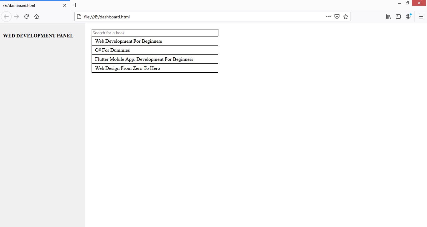
THE DASHBOARD CODE
<!DOCTYPE html>
<html>
<head>
<style>
.left{
    position:fixed;
    background:#f0f0f0;
    top:0;
    right:0;
    bottom:0;
    left:0;
    width:20%;
}
.inner{
  padding:10px;
}
.right{
  position:absolute;
  background:#fff;
  top:0;
  right:0;
  bottom:0;
  width:80%;
}
.result{
  position:absolute;
  top:42px;
  width:405px;
  background:#fff;
}
#search{
  width:400px;
}
.content{
 padding:20px;
}
.result ul{
   list-style-type:none;
   padding:0px;
   border:1px solid #000;
   margin:0px;
}
.result ul li{
  border-bottom:1px solid #000;
  padding:5px 10px 5px 10px;
}
</style>
</head>
<body>
    <div class="left">
        <div class="inner">
            <h4>WED DEVELOPMENT PANEL</h4>
        </div>
    </div>
    <div class="right">
        <div class="content">
            <input type="text" id="search" placeholder="Search for a book" />
            <div id="result" class="result">
                <ul>
                    <li>Web Development For Beginners</li>
                    <li>C# For Dummies</li>
                    <li>Flutter Mobile App. Development For Beginners</li>
                    <li>Web Design From Zero To Hero</li>
                </ul>
            </div>
            <h4>DASHBOARD</h4>
            <p>Our dashboard content comes here</p>
        </div>
    </div>
</body>
</html>
Colors
You can use regular colors such as red, yellow, green, white, orange, pink etc as well as color codes.
You can pick the color from an image using photo shop or you can as well google for list of color codes.
Examples:
#FFFFFF for white
#000000 for black
As you can see above, the color codes begin with the #
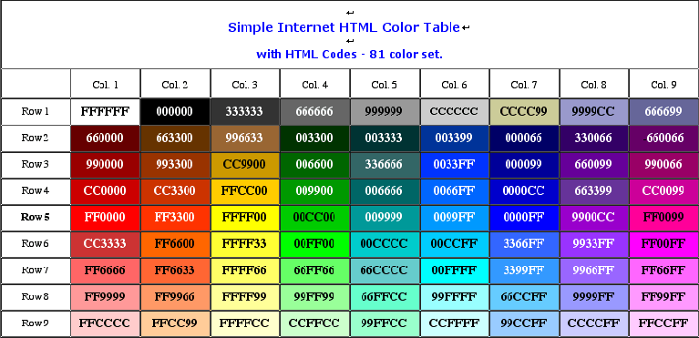
Figure: Color codes
To assign a color to an element, the color attribute is used. Thus:
<style>
 p{
    color:red;
 }
div{
   color:#FFFFFF;
}
</style>
Fonts
If no font type is specified, the browser uses its default font type. You can specify a font type with the attribute font-family. Thus:
<style>
  body{
     font-family: "Times New Roman", Times, serif;
  }
</style>
Examples
Serif Fonts
Georgia, serif
"Palatino Linotype", "Book Antiqua", Palatino, serif
"Times New Roman", Times, serif
Sans-Serif Fonts
Arial, Helvetica, sans-serif
"Arial Black", Gadget, sans-serif
"Comic Sans MS", cursive, sans-serif
Impact, Charcoal, sans-serif
"Lucida Sans Unicode", "Lucida Grande", sans-serif
Tahoma, Geneva, sans-serif
"Trebuchet MS", Helvetica, sans-serif
Verdana, Geneva, sans-serif
Monospace Fonts
"Courier New", Courier, monospace
"Lucida Console", Monaco, monospace
Setting font size
To set the size of the font, the attribute font-size is used. Thus:
<style>
   body{
     font-size:12px;
   }
</style>
Bolding text
To make a text bold, the attribute font-weight is used. Thus:
<style>
  .bold{
     font-weight:bold;
  }
</style>
CSS font-style Property
To make a text italic, the font-style attribute is used. Thus:
style{
  .italic{
     font-style:italic;
  }
}
Background Color
To set the background color, the attribute background or background-color is used. Thus:
<style>
   body{
       background:#F5F5F5;
   }
   .red{
        background-color:red;
   }
</style>
Background mage
To add a background image to an element, the attribute background-image is used. Thus:
<style>
    body{
        background-image:url('bg.jpg');
    }
</style>
The url specifies the path or link where the image can be found. Therefore if the image is in the images folder, the url should be images/image and if the image is in another folder outside where the css style file is, it should be ../path to image. The number of ../ depends on how many folders that has to be by passed before the image folder or file can be located.
For example if we have the css style in a css folder in our project and the image is in the images folder in our project, then we have to get out of the css folder once before we can find the images folder. Hence the url will be: ../images/image. Thus:
<style>
    body{
        background-image:url('../images/bg.jpg');
    }
</style>
If the background image is smaller than the element, the image will repeat itself, horizontally and vertically, until it reaches the end of the element. To avoid the background image from repeating itself, set the background-repeat property to no-repeat.
<style>
    body{
        background-image:url('bg.jpg');
        background-repeat: no-repeat;
    }
</style>
Background Cover
If you want the background image to cover the entire element, you can set the background-size property to cover.
To make sure the entire element is always covered, set the background-attachment property to fixed:
This way, the background image will cover the entire element, with no stretching (the image will keep its original proportions):
Example
<style>
   body {
        background-image: url('bg.jpg');
        background-repeat: no-repeat;
        background-attachment: fixed;
        background-size: cover;
   }
</style>
Background Stretch
If you want the background image to stretch to fit the entire element, you can set the background-size property to 100% 100%:
<style>
  body {
    background-image: url('bg.jpg');
    background-repeat: no-repeat;
    background-attachment: fixed;
    background-size: 100% 100%;
  }
</style>
Border Styles
Setting border radius
To set the border radius of an element, the border-radius attribute is used. For the entire corners, you simply specify the dimension for each of the corners. Thus:
<style>
    .btn{
       border-radius: 10px;
       background:blue;
    }
</style>
To specify the radius for specific corners, specify the dimension for the top left, top right, bottom right and bottom left corners. Thus:
<style>
    .btn{
       border-radius: 10px 10px 0px 0px;
       background:blue;
    }
</style>
To make an element circular, set the border-radius to 50%.
Example
style{
    .notification{
        background:red;
        width:20px;
        height:20px;
        line-height:20px;
        padding:5px;
        border-radius:50%;
        text-align:center;
        color:#FFFFFF;
    }
}
The border-style property specifies what kind of border to display.
The following values are allowed:
- dotted - Defines a dotted border
- dashed - Defines a dashed border
- solid - Defines a solid border
- double - Defines a double border
- groove - Defines a 3D grooved border. The effect depends on the border-color value
- ridge - Defines a 3D ridged border. The effect depends on the border-color value
- inset - Defines a 3D inset border. The effect depends on the border-color value
- outset - Defines a 3D outset border. The effect depends on the border-color value
- none - Defines no border
- hidden - Defines a hidden border
The border-style property can have from one to four values (for the top border, right border, bottom border, and the left border).
Examples
<div style="border-style:dotted">
  Dotted Border
</div>
<div style="border-style:dashed">
  Dashed Border
</div>
<div style="border-style:solid">
  Solid Border
</div>
<div style="border-style:double">
  Double Border
</div>
Setting border color and thickness
To set the thickness and color of specific side border, the css below can be used:
<style>
   .bordered{
      border: 1px solid #000000;
   }
   .dotted{
      border: 1px dotted #000000;
   }
   .dashed{
      border: 1px dashed #000000;
   }
</style>
You can as well set for a particular border side. You either use border-top, border-left, border-right,border-bottom to set the borders for that side.
Example
<style>
   .top-border{
       border-top:1px solid #000000;
   }
   .left-border{
       border-left:1px solid #000000;
   }
   .right-border{
       border-right:1px solid #000000;
   }
   .bottom-border{
       border-bottom:1px solid #000000;
   }
</style>
Assignment
Design a page that has top part fixed and about 20% of the left side also fixed just like https://www.youtube.com/


